Minimalist Scandi Style Refurbishment
Turn-key Project
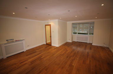
Scandi style refurbishment – Our client had purchased a modest two bedroom apartment which had not been updated for decades. A collection of 80’s orange woods, ancient plumbing and utilities, it required a total renovation to transform it into a calm sanctuary for her to relax and unwind. She is a busy professional woman living abroad and was looking for a designer she could trust to create the look and feel she desired. She required total project management and a turn-key solution to ensure that everything was in place from the furniture and furnishings to the bedding and cutlery when she arrived.
Creating Flow
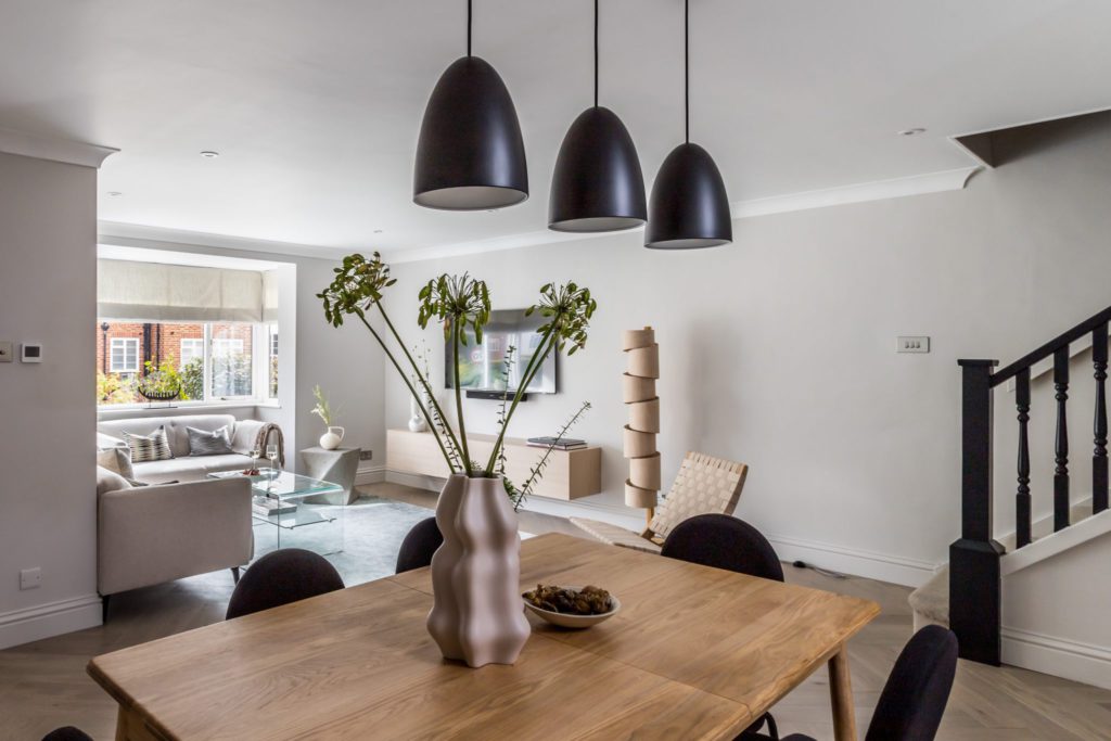
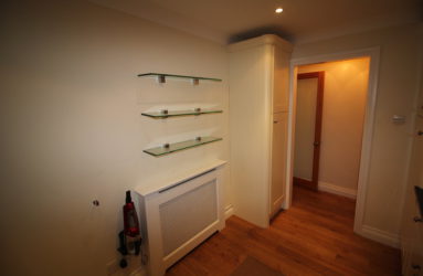
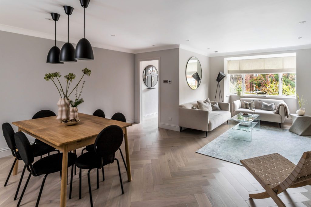
Our starting point was to assess the space and create a layout that would open up this relatively small apartment so that it would feel much larger than it actually is. We did this by removing sections of the walls to improve the flow of the space and provide a beautiful vista of the property wherever you stand. We removed the inner porch, which was not providing any real insulation or other purpose in the design. Guests now enjoy a wonderful view across the beautifully open dining area as soon as they step inside. Meanwhile, the hallway storage prevents anyone standing on the doorstep from seeing beyond, providing privacy for our client.
Uncluttered Aesthetic
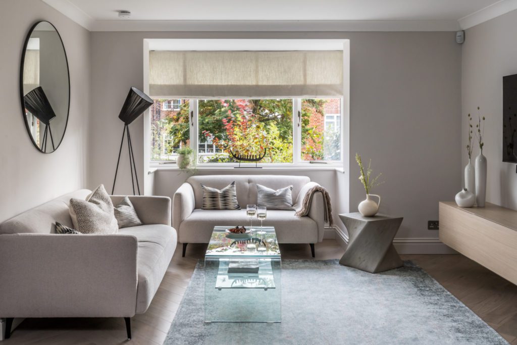
Perhaps one of the most important decisions was the choice of the gorgeous Havwoods herringbone flooring. We had removed the radiators from the ground floor and laid underfloor heating, both for the appeal of the uncluttered aesthetic that freedom from radiators provides and the efficiency of the temperature control. Engineered wood is an excellent flooring solution to conduct heat efficiently, and the choice of the parquet sets the look and feel for the entire design. The gentle pattern and quiet wood tone elevates the design and ensures that minimal equals elegant rather than too clinical a design.
Gentle Colour Palette
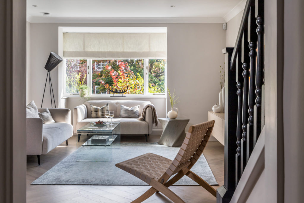
The minimalist Scandi look and feel is achieved by creating a gentle colour palette, in this case warm soft neutrals, with touches of blue and green, layers of natural textures and a carefully considered choice of furniture. You will notice that we only purchased a very few pieces, the absolute minimum required, but that every one looks beautiful, is extremely comfortable and adds to the overall design. This beautiful look is timeless and will not need to be updated for a very long time.
Hidden TV Wires
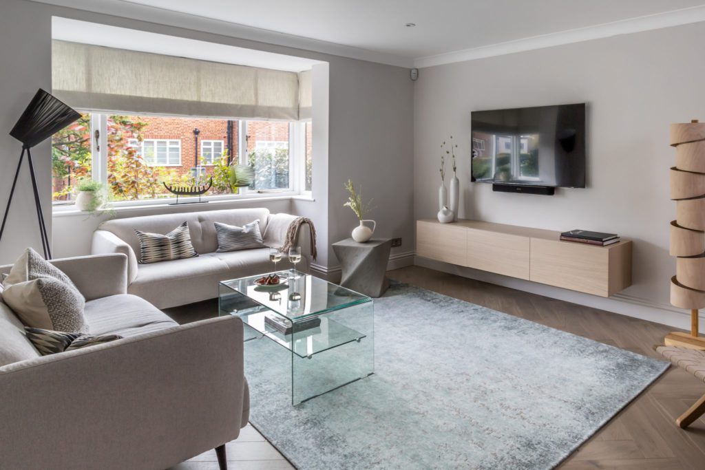
Touches of black anchor the design and provide the important contrast that brings the neutral scheme to life. The client was happy to allow the TV to stand undisguised. This only works because of the balancing black details in the lamp, banister and pendant lights behind. The media unit is a bespoke element designed to hide any wires and float above the ground to add to the overall feeling of space. Layers of light complete the look and feel with LED strips tucked under the media unit, banister and the wonderful spiral of light created by the freestanding wooden lamp.
Contemporary Boutique Hotel Feel
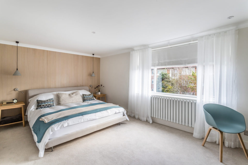
Moving upstairs, the master bedroom captures the look and feel of a contemporary boutique hotel with floor to ceiling curtains that add softness without dominating the space, combined with Roman Blinds for black out and a good night’s sleep.
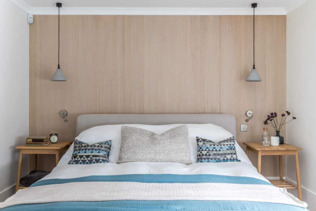
Scandi Style Panelling
The wall behind the bed was panelled with 1mm prefinished natural wood panels to continue the Scandi design. If you are thinking that this is something that you might like to do for yourself, you will be pleased to know that it is actually easier to apply than you might think. Using the correct adhesive is key.
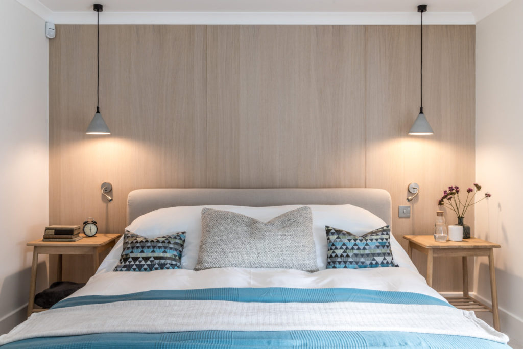
Concrete Pendant Lampshades
We chose pendant lighting to make the most of the limited space and create another beautiful layer of light. The shades, available from Holloways, are concrete, which not only adds another natural texture but ensures that all the light is forced downwards, where you want it, and casts an attractive shape on the wall behind.
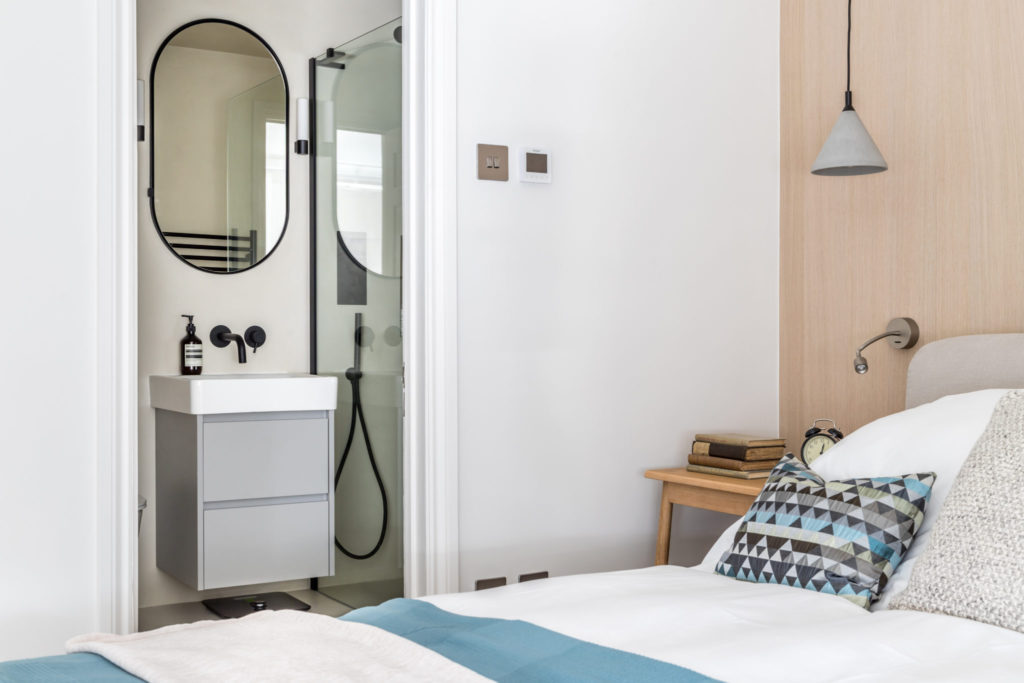
En-suite Seamless Microcement Finish
The tiny en-suite was redesigned to, again make the most of the space, by removing the cramped bath and fitting a large walk-in shower. A small room seems larger if you keep to one colour and have as few lines and details as possible. In this case we chose to decorate with microcement, which is a brilliant material, perfect for bathrooms, providing a seamless finish and available in a wide range of colourways.
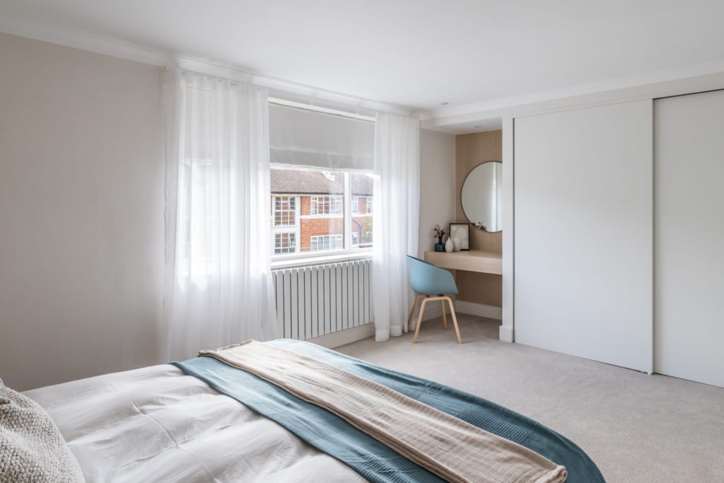
Floor to Ceiling Wardrobe Design
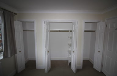
There had been a reasonable amount of storage in the property when our client purchased it, but it was bulky and unattractive. We retained two thirds of the space allocated to the wardrobes, rebuilding them in a simple floor-ceiling sliding design. The final third we transformed into a built-in dressing table with bespoke drawer for make-up and personal accessories.
Home Working Area
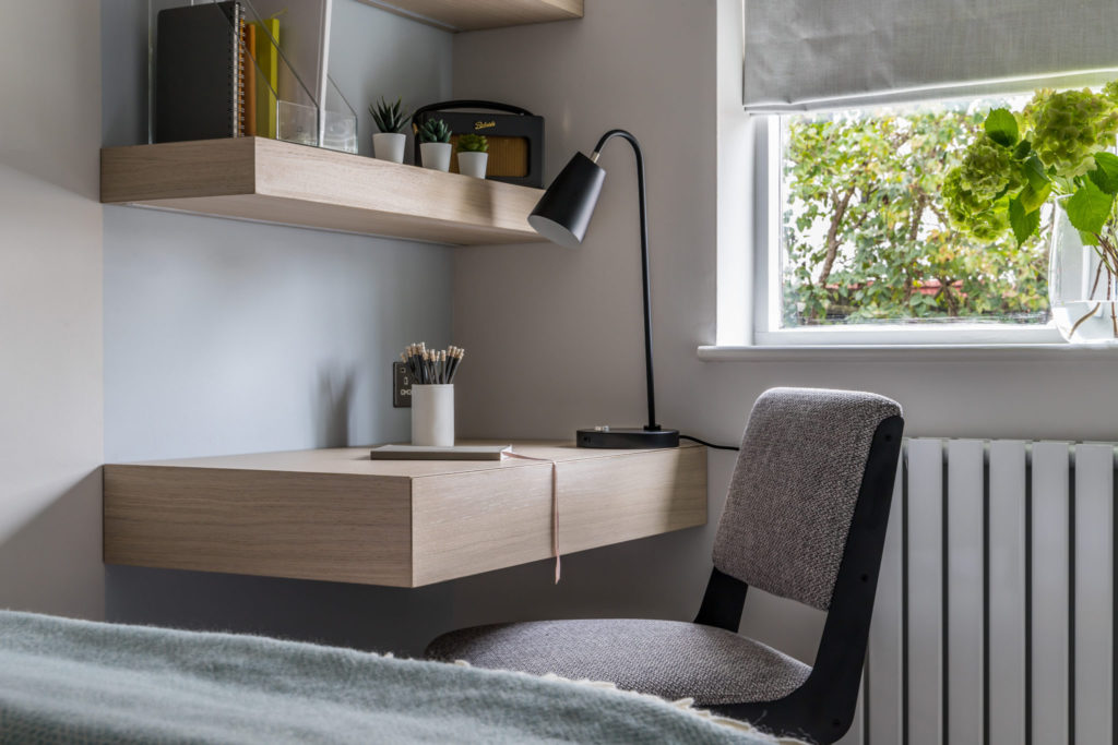
Through to the tiny guest bedroom, our client needed to include a double bed for visitors as well as, so often the case these days, an additional desk for working from home. We designated this “working” area with a gentle colour block wall and created a bespoke desk with drawers to ensure that it is easy to tuck all signs of work away at the end of the day.
Invisible LED Lighting
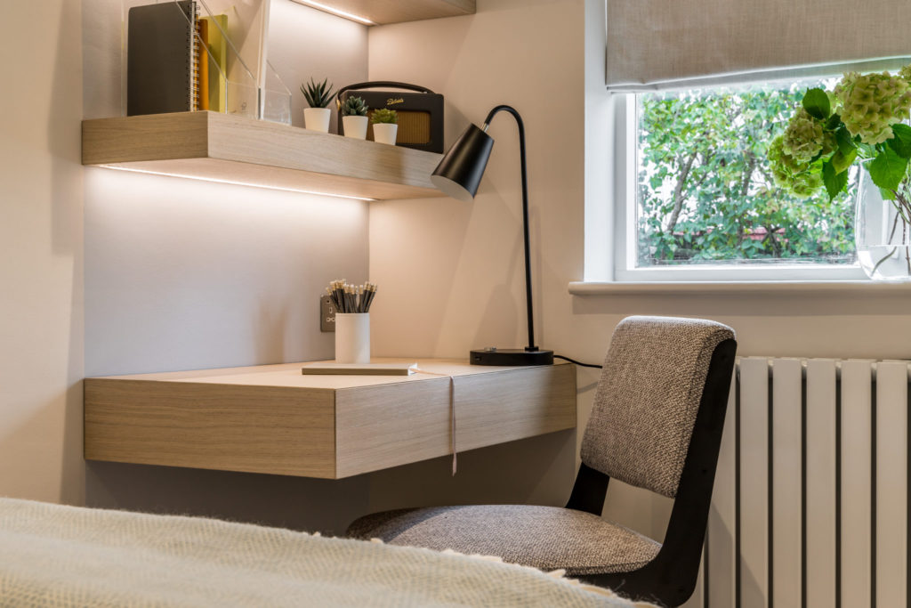
Again, we added an invisible LED strip of lighting under each shelf. Importantly, the chair is comfortable to work at, providing the support needed, but is just as happily at home at a dressing table as in an office.
Small Bathroom Design
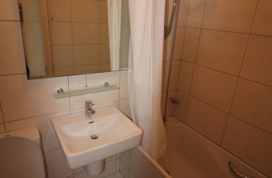
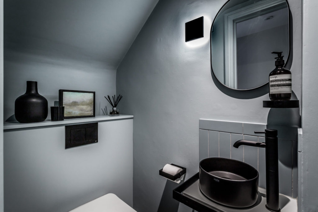
Finally, the smallest room in the house is the downstairs cloakroom. To make the most of the space, again we chose one colourway and took it across every surface and up over the ceiling, with as few lines as possible. In this case Celestial Blue from Little Greene, combined with tiles in the same shade of blue from Mandarin Stone and black accessories.
What our Client Said:
“You have been an absolute godsend. I greatly appreciate the high quality of your creative input, your initiative and exceptional overall project management as well as your careful management and oversight of the construction and the procurement. There isn’t a single aspect of the project or the process that you did not handle brilliantly. I’m extremely grateful.”
For further inspiration and ideas, you can find more of our featured projects here.
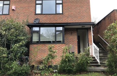
Before Photos
Scandi Style Refurbishment Credits:
At Decorbuddi we work as a team with our clients, colleagues and trusted preferred suppliers, each and every one contributing to the successful delivery of the project. This Scandi Style refurbishment project was designed by Decorbuddi interior designer: Amanda Delaney
Photography: KT1 Photography

