Luxurious Loft Extension
The interior design of a 1930’s loft extension to add primary suite, including bedroom, bathroom and dressing area.
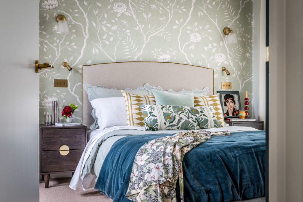
We had already had the opportunity to work with our client on the downstairs of this property, when we were invited to help with the interior design of their new loft extension. Our objective was to create a luxurious primary suite, with cohesion between the sleeping, dressing and bathing areas.
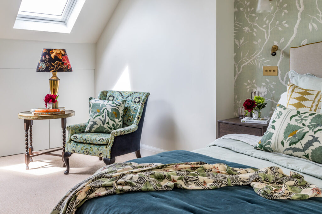
The starting point was to review the loft layout to ensure that we were making the most of the space available. Our client was very open and encouraged us to assess all elements of the existing plan.
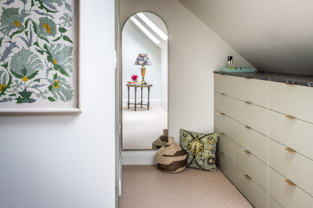
As is often the case, storage was very important. We identified an under-utilised niche area above the staircase, that could be used to expand the wardrobe space and dressing room. We designed the positioning of the staircase to accommodate this change in layout.
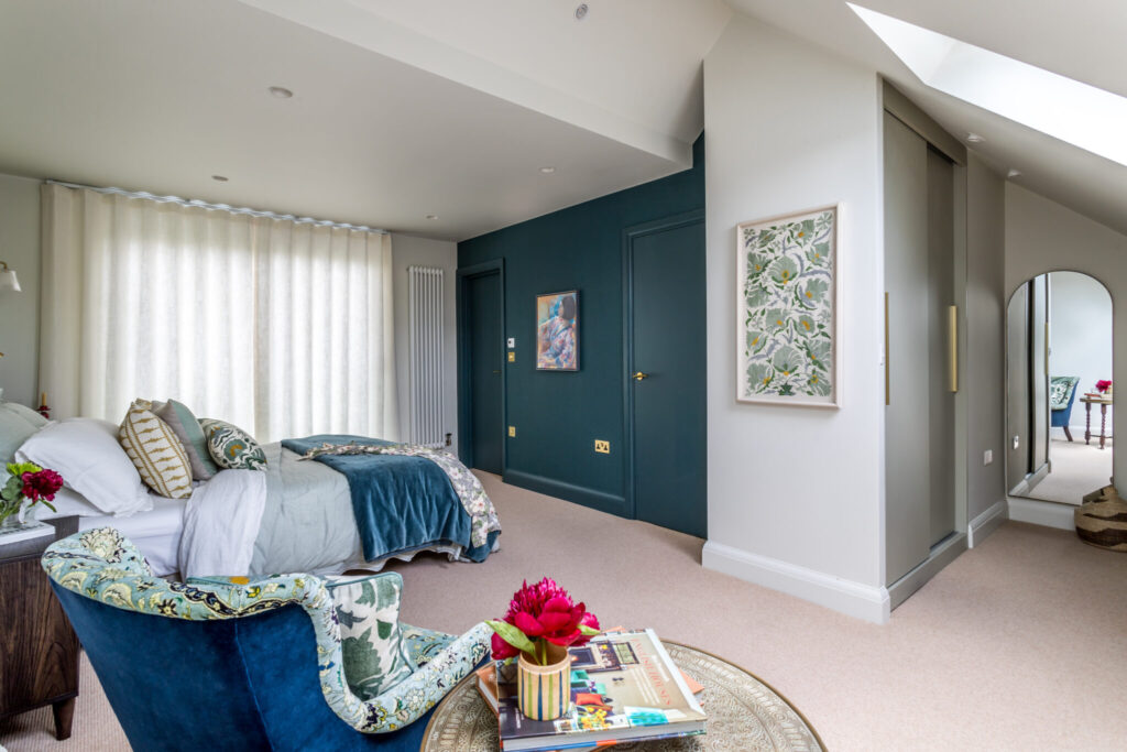
Loft spaces can be challenging. They often have low or awkwardly shaped ceiling heights. Here, the back of the house is of standard dormer height, rising to an unconventional pitched roof towards the middle of the room. We selected a natural green and blue palette and drenched the walls and ceiling in Pale Stone Green by Little Green to disguise the peaks and troughs in the shape of the ceiling.
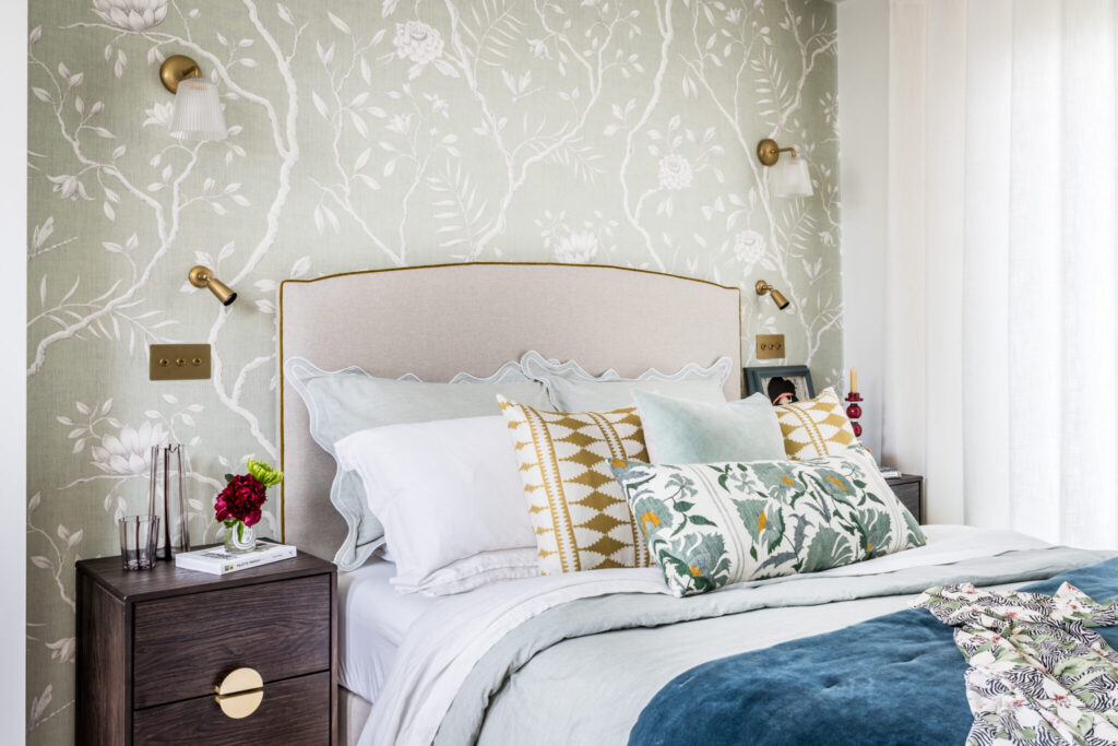
We introduced beautiful Chinoiserie wallpaper on the bed-head, wall in-keeping with the 1930’s period of the house and with a nod to our clients Asian heritage.
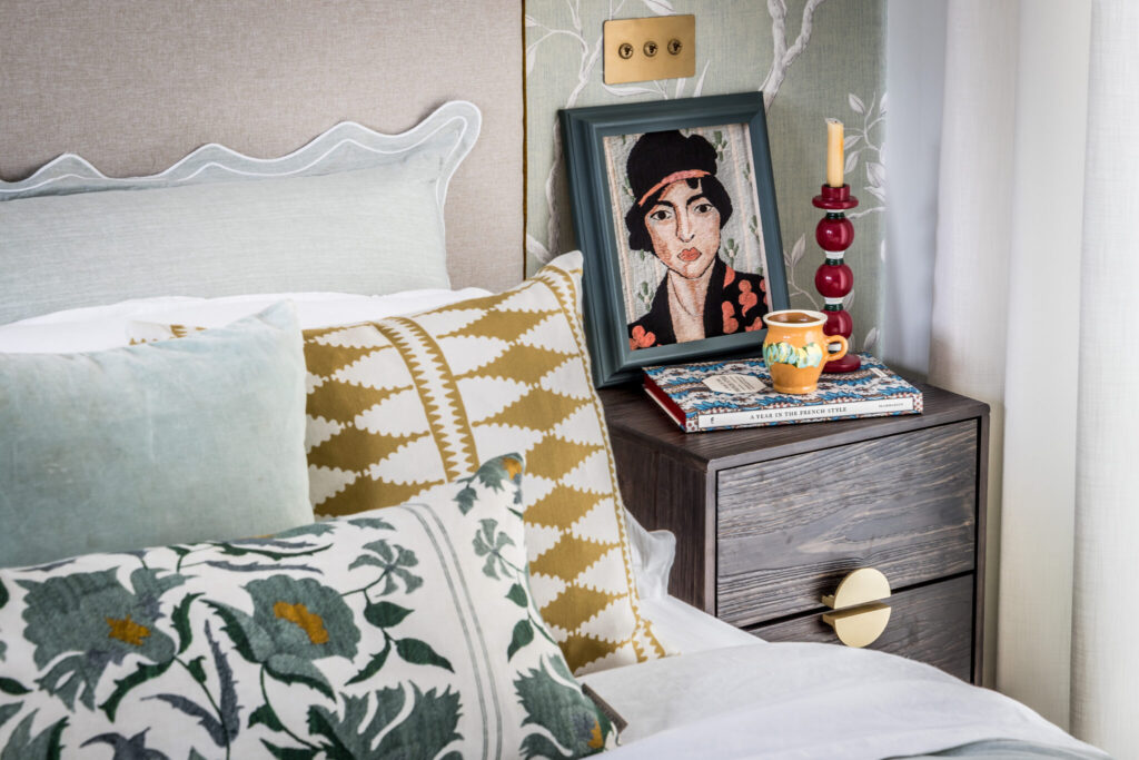
The choice of patterns, colours and organic materials are all designed to bring the outside in, reflecting the proximity of the property close to the open grasslands of Bushey Park.
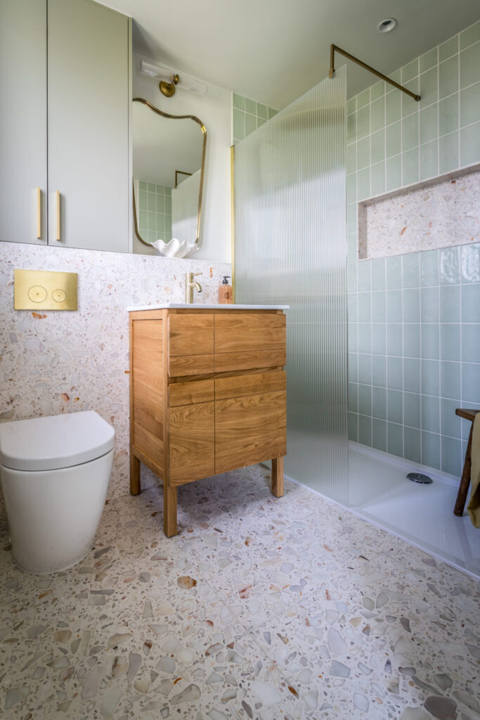
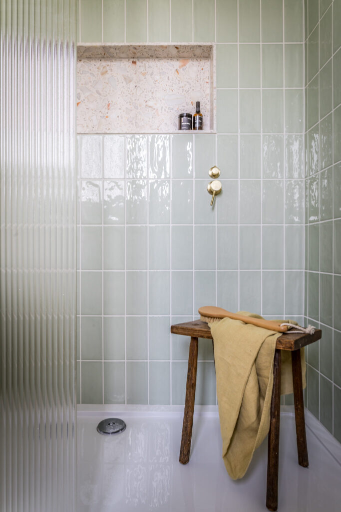
This natural green scheme flows through into the bathroom, where it is combined with beautiful sandy, Terrazzo Marble tiles. The deep teal textured wallpaper along the bathroom wall, zones the relaxing bathroom area.
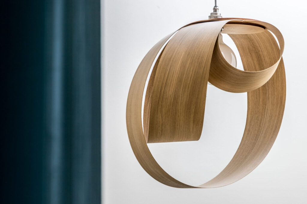
The natural theme continues outside onto the landing with the organic shape of the Tom Raffield wooden light fitting and coir carpeting.
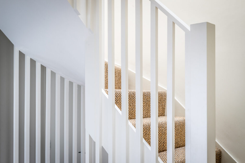
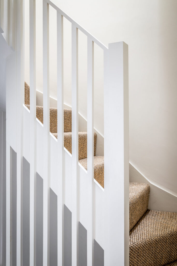
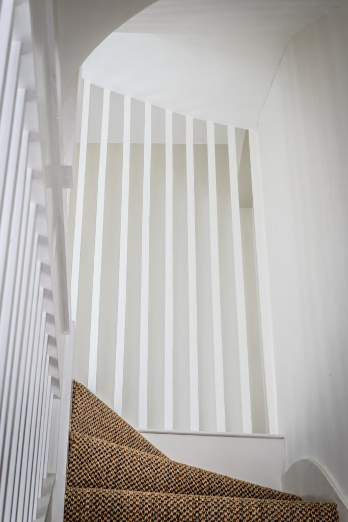
The existing staircase had been replaced in the 1980’s and so was both looking tired and lacking in architectural integrity. We removed the 1980’s spindles to create a light, cleaner more minimalist “Japandi” design. This enabled us to integrate the new loft stairs with the rest of the house.
1930’s Loft Extension Project Credits
At Decorbuddi we work as a team with our clients, colleagues and trusted preferred suppliers, each and every one contributing to the successful delivery of the project. This 1930’s loft extension project was led by Decorbuddi Interior Designer Stephanie Bailey
Photographer: KT1 Photography
