How To Use Colour : Blue
How to use colour: Blue is the colour of calmness and serenity. The colour of the sky. It is the most popular colour in decor, whatever the trends. A bold choice, blue is no longer reserved for boys’ bedrooms and the occasional bathroom or kitchen. Reminiscent of boutique hotels with its cool vintage tones, deep blue is the perfect way to give your room a rich makeover.
Why Choose Blue?
As gorgeous as a rich blue is, there are practical benefits to a deep blue room too. Often the first instinct is to paint a room white, to create a sense of space in an average sized room. But a light colour can sometimes have the opposite effect. Paint a room a dark colour, light it sensitively, and it will make a small space seem bigger.
White is strong and bold. It will highlight every defect in your paint and every uneven surface where a colour meets the white. It is also quite cold. Perfect for the sunny climates of Greece or the Algarve but here in the UK, it can feel stark if it isn’t combined with bright artwork or layers of soft textures and coloured fabric.
Consider also how and when the space is used. If you find yourself using sitting in the room more often in the evenings when the sun has gone, the space could feel clinical when painted white. Using blue will create a cosier space that makes the most of a fireplace or low atmospheric lighting.
How to Make it Work
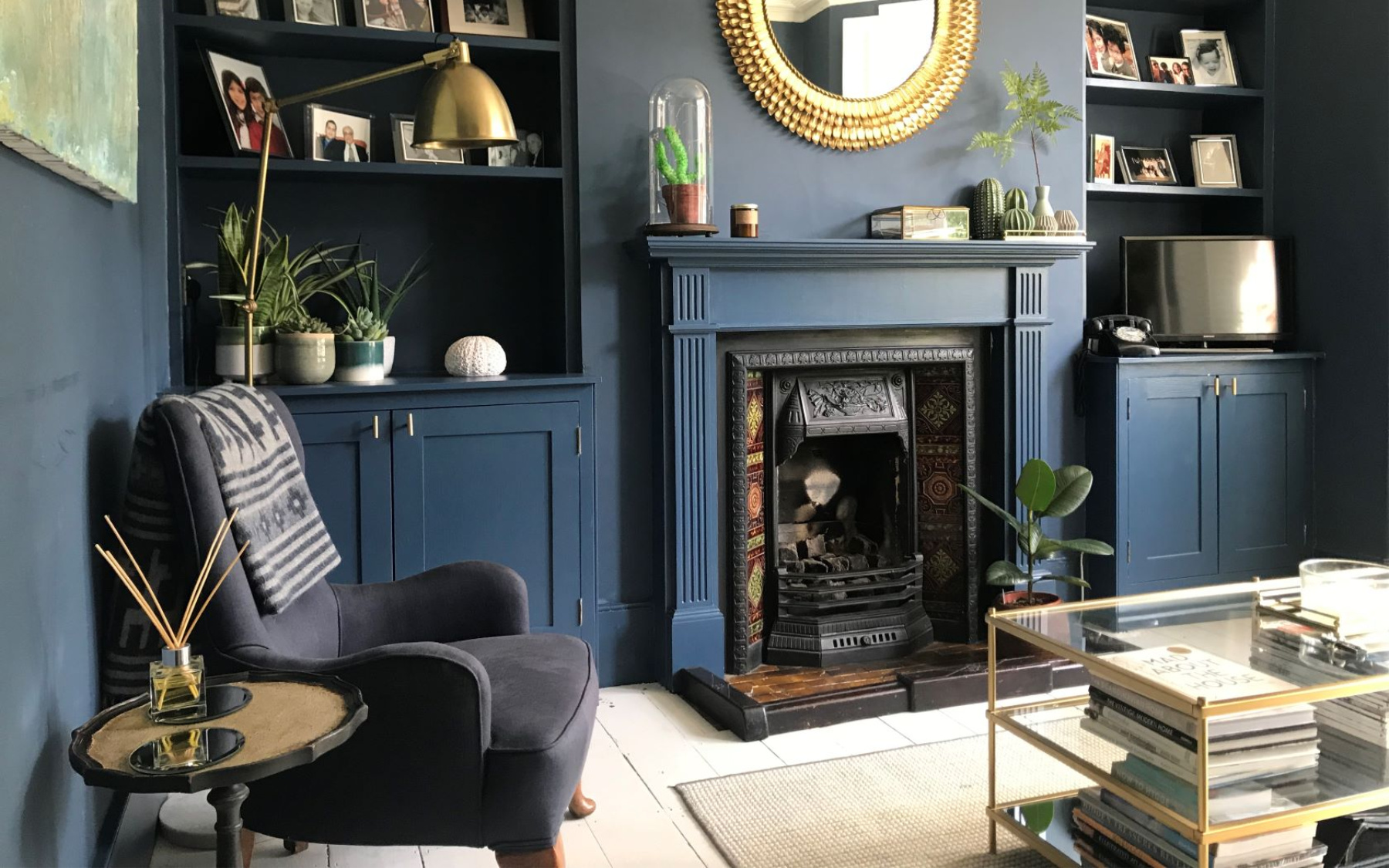
Choosing the tone of blue is critical to making the colour work. For a recent Decorbuddi project, pictured above, we chose Stiffkey Blue from Farrow and Ball. Choosing this beautiful, inky blue, shade complements the rich brown, original tiling of the fireplace. It feels warm in the evenings and, taken across all the walls and woodwork, across the alcoves and down to the skirting boards, it creates a perfect seamless finish.
Balance the blue tones with the other features in the room. For this project, the blue was balanced by the white floor, shutters and lampshade, which created just enough light to keep it uplifting and atmospheric. Too much blue, without any light, can become depressing. This combination is absolutely lovely.
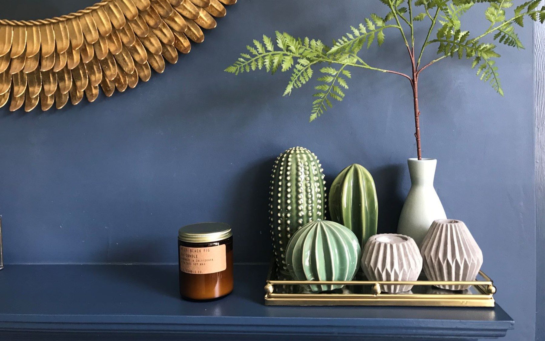
The final additions were a complementary green velvet sofa, luxurious touches of gold and brass, and a glass table and mirror to bounce the light. Heavenly.
For more advise on how to make colour work in your home, consider enlisting one of our Buddies to help. We would love to help you to create your individual home or garden.