Brighton Interior Design, Kitchen & Garden Design
Bringing The Garden Inside
Brighton Interior Design & Garden Design
This is the home of Decorbuddi Co-Founder, Debbie Blott and family. She enlisted the help of Decorbuddi interior designer, Tracy Duncan and garden designer, Jo Connolly to help renovate the house and garden together.
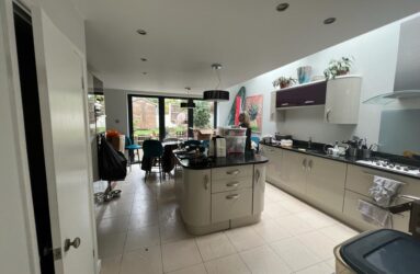
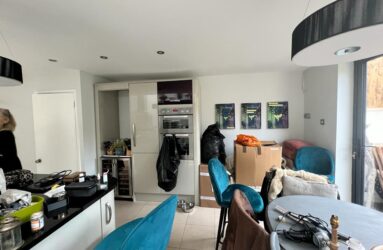
The extension was existing but the interior and garden had not been considered together. Both kitchen and garden felt small and dark. They had been designed separately with a small red brick paved area in the garden, surrounded by high fencing and large shed.
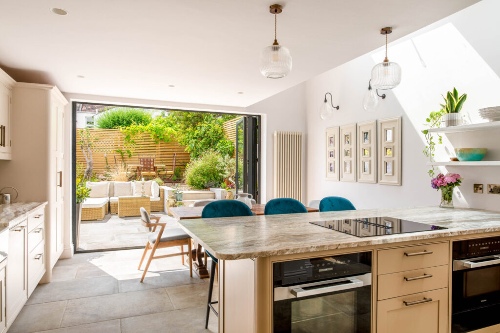
Starting with the layout, we pushed the garden wall back to make enough space for a seating area at ground level and chose materials that would bring the interior and exterior spaces together. The kitchen now feels twice the size it did before and is light and uplifting. The almost Mediterranean feel of the garden flows into the kitchen for light and bright, indoor/outdoor living.
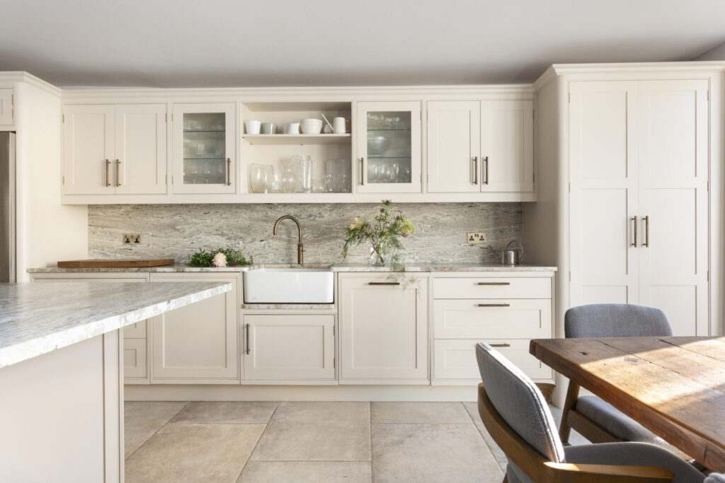
Worksurface Wow Factor
The stand-out feature is the beautiful worksurface. A hard-working kitchen, designed for entertaining, we sourced a tough worksurface that would stand up to knocks and spills but also look beautiful. Visiting the stone yard we chose a slab that looks like marble but has the properties of granite. The leathered, non-glossy finish suits the natural inside/outside aesthetic.
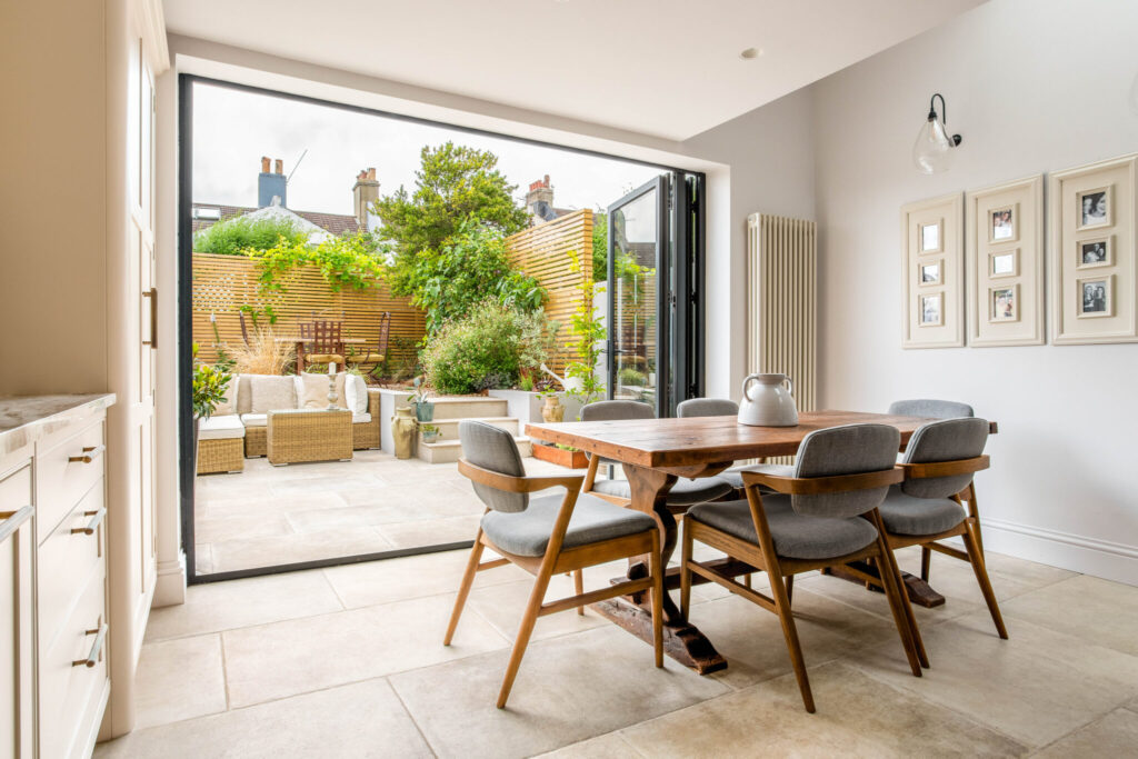
Flooring to Flow Inside & Out
The choice of large, stone effect porcelain floor tiles flowing from kitchen into garden is transformative. The only difference in the tiles is the thickness and finish of the exterior version which ensures that they are suitable for all weathers.
The tiles and worksurface formed the starting point for the palette of warm toned neutrals, touches of grey and natural textures.
The antique dining table, originally from France, was sourced locally in Sussex.
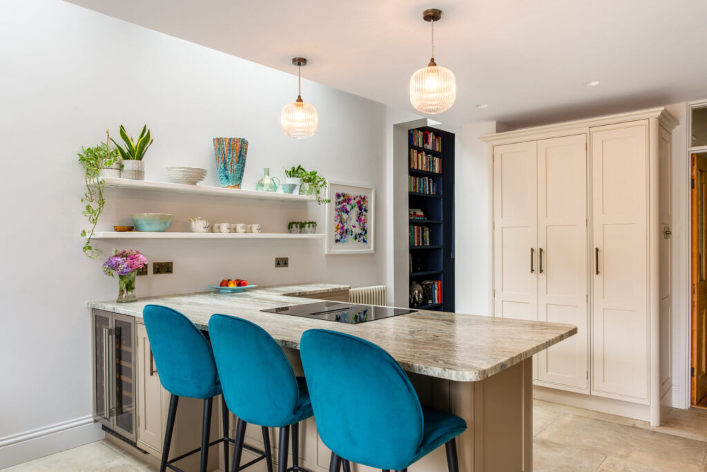
New Layout Designed for Living & Entertaining
We removed a section of the interior wall to create direct access to the living area. This is perfect both for entertaining and day to day living. The induction hob and integrated extractor is centred on the L-shaped island to provide a view of the garden when cooking.
We kept the north interior wall free of high level cupboards to emphasise the sense of space and enable us to create a more decorative finish. You can just see the floor to ceiling book-shelves we built in the central snug area. Adjacent to the kitchen, they are handy to store cook books as well as family photographs and general library.
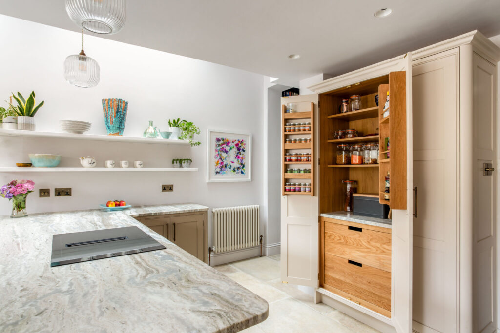
Bespoke Kitchen Detailing
The design is carefully considered with the ribbed detailing picked up in the glass of the pendants, cupboard doors, luxury handles and traditional radiators.
The double fronted larder design includes spice rack, deep pan drawers and sockets. The beautiful curve of the joinery softens the look and feel of the kitchen and works with the design of the work-surface and pendant lighting and upholstered seating.
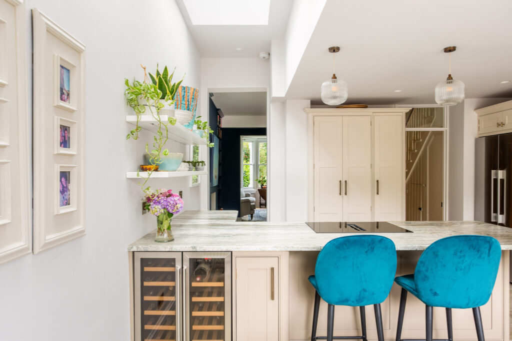
View From Back to Front Garden
We took the compact size of the property and turned it to our advantage. There is always a view outside.
Considering the interior, exterior and kitchen together enabled us to make the most of every feature. Removing just a small section of wall made a spectacular difference.
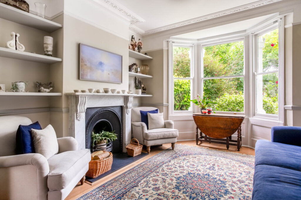
Colour and Decor
This beautiful Persian rug was existing. We used it as the starting point for the colour scheme in the living room. The walls are Fenwick and Tilbrook Collared Dove and the woodwork Pigeon. The mix of grey and warm toned neutrals are the perfect foil for the bold colours of the garden seen through the bay window.
The new deep blue sofa has just enough colour to add interest, with pops of berry red in the ceramics and artwork (out of sight on the wall behind the sofa), connecting with the roses in the garden in the summer and berries in the winter.
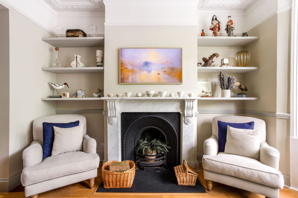
Picture Frame Art TV
We sourced a picture frame art TV for the living room. A surprisingly cost effective option, it fits close to the wall and offers a choice of frames and artwork.
It is a relatively easy to channel the wires into the plaster. No black boxes, media units or TV storage required. The living room looks fabulous.
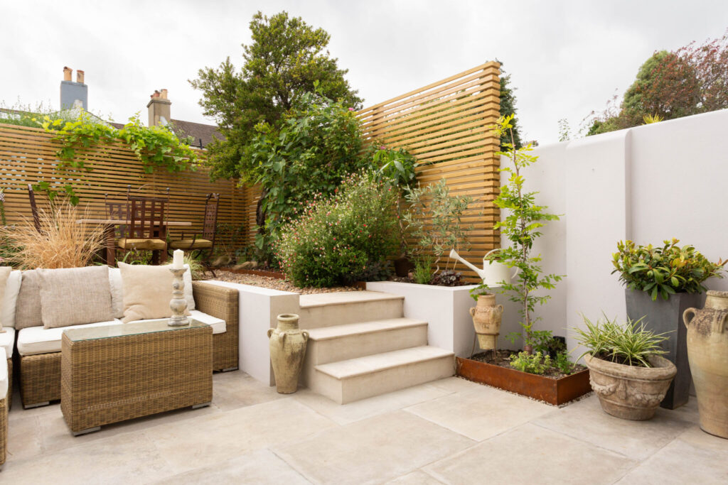
Beautiful Easy Maintenance Garden
Moving a section of the existing wall back to give more space at ground level has made an enormous difference.
The slatted fencing provides a level of screening and a frame on which the plants to grow. The space between the slats allows the Brighton breeze to flow and a lighter more spacious look and feel. Corton steel edging elevates the quality of the design detailing.
The planting is a mix of pollinators and grasses. There is an apple tree at the back of the garden, wisteria and sweet-smelling jasmine.
The plants had only just been planted when this photo was taken. It will be a verdant oasis in a year or so.
Brighton Interior Design, Kitchen & Garden Credits
At Decorbuddi we work as a team with our clients, colleagues and trusted preferred suppliers, each and every one contributing to the successful delivery of the project. This Brighton interior was designed by Tracy Duncan and the garden by Jo Connolly.
Photography by Limelight Interiors Photography

