UK Home From Home
Our client approached us to complete work on their new build Lewes property. The scope included fixtures, furniture, colours and fabrics. Our objective was to create a beautiful backdrop for them to dress with their personal possessions when they moved in.
An international family, they live abroad but their eldest daughter attends boarding school in the UK. The apartment was planned to be used as a place to stay when they visit. As a second home we had a carefully considered budget to work within.
The main aspect of the brief was to create a contemporary home with a feeling of warmth throughout. Our clients were drawn to more muted tones and so we curated a neutral pallet of greens, greys and the occasional pinks and blues. This works well with the existing colours found in the wooden flooring and anthracite grey window surroundings, with pops of colour and texture for a homely touch to compliment the desired minimalist look and feel.
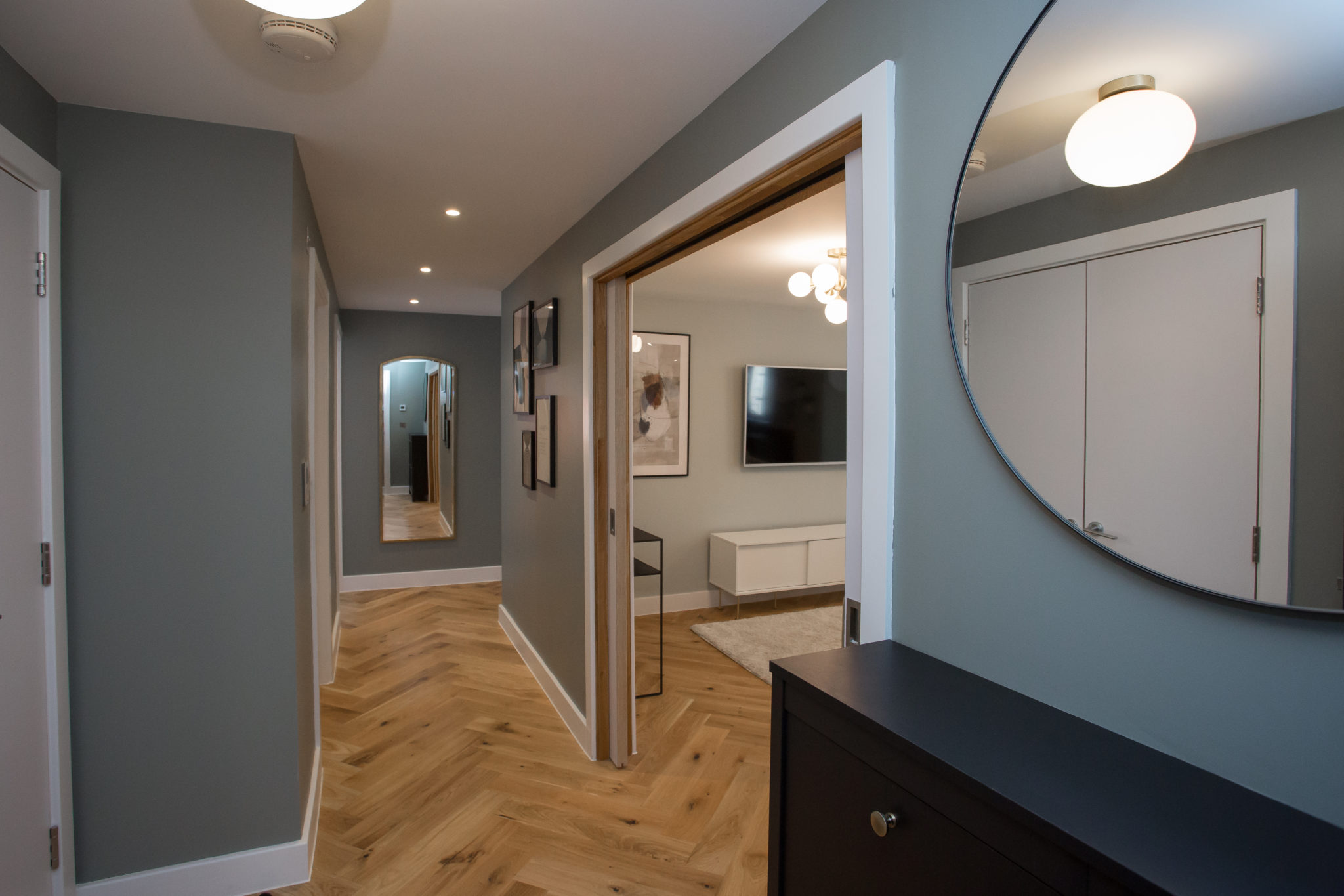
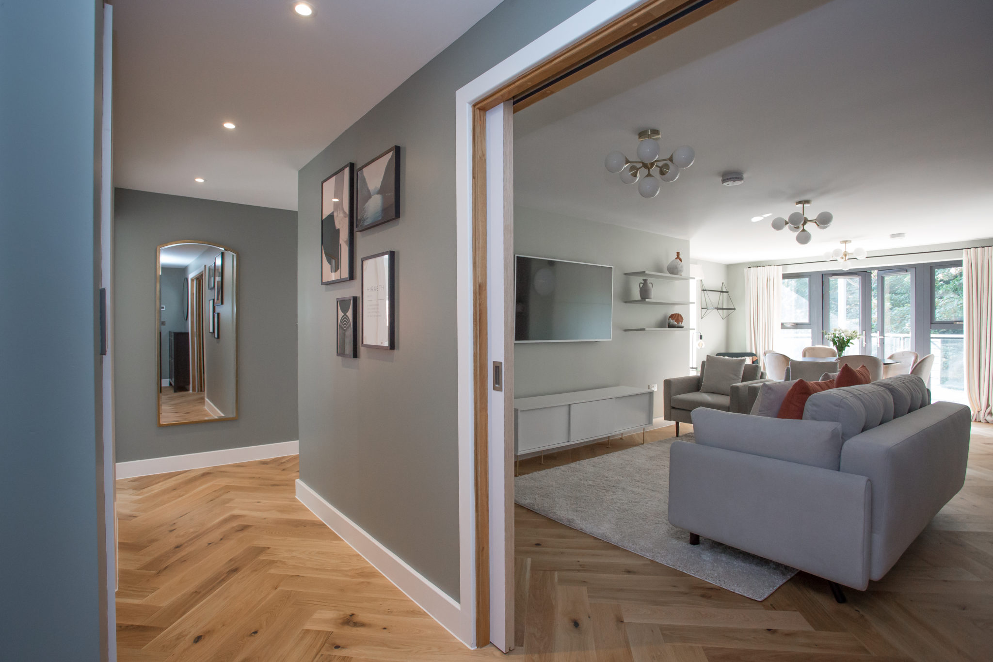
Hallway
In the hallway, we introduced a subtle grey-green tone, Pigeon by Farrow & Ball, which enhanced the existing wooden flooring. We added a simple, yet sophisticated globe pendant from Lampsy alongside sleek contrasting black furnishings. At the back, we included a brass mirror for warmth, but also to create the illusion of space. The abstract artwork helps to inject identity and interest, and overall makes the space very welcoming.
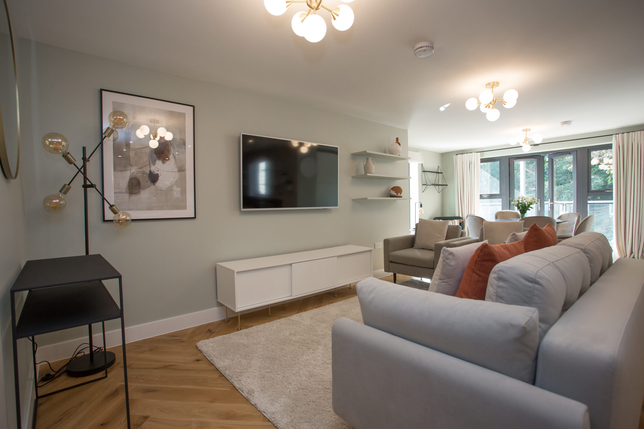
Sitting Area
In the sitting area, we channelled the contemporary look our client wanted through modular furniture and statement lighting. As the space is all open-plan, we zoned the sitting area by placing a sofa and armchair around a central rug. We painted the walls with Cromarty by F&B, a muted green colour. The contrasting black furniture works really well with the neutral pallet, and the brass and opal tones creates a warm glow.
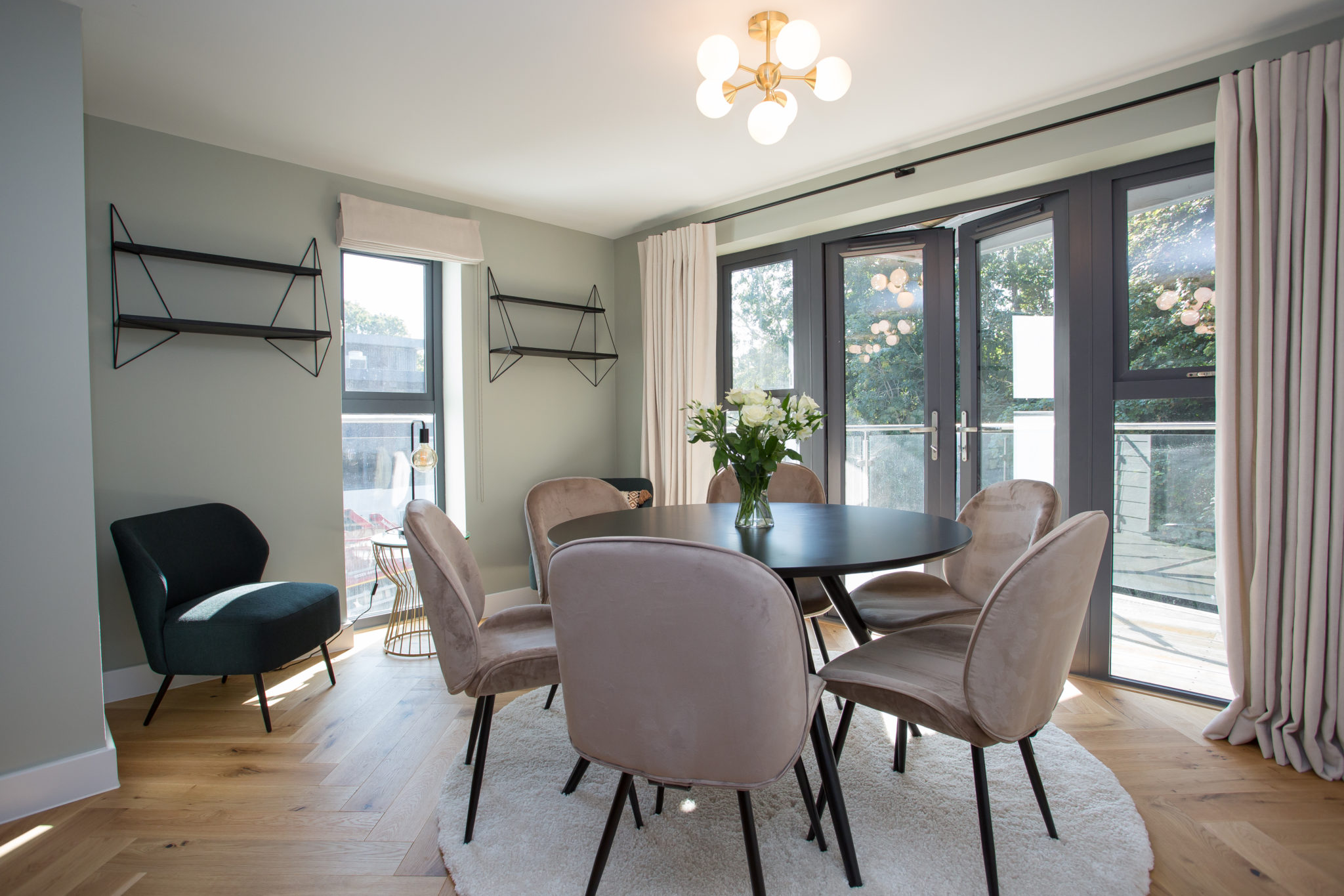
Dining area
For the dining area, we created a separate space marked by a subtle colour difference on the walls – F&B’s Mizzle – which sits well in the natural light. Originally the sitting area, we felt this space worked better for dining. We introduced a circular dining table and rug to contrast the modular shapes found in the sitting area. Our client wanted a snug area for their children to sit and read, so we added chairs by the window. The black shelving provides both storage and depth.
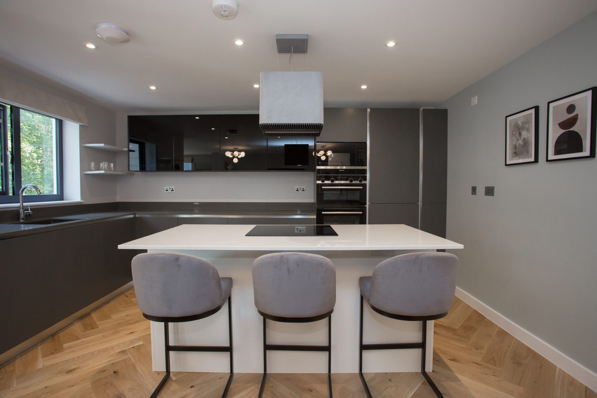
Kitchen
In the Kitchen the client wanted new wall hung units. To match the original kitchen was above our budget so we sourced black smoked glass kitchen units from Howdens which contrasted with the existing kitchen, but matched the black glass appliances giving it a cohesive feel throughout the space.
We opted for a cool and delicate grey on the walls which works well with the existing concrete effect island and anthracite grey worktops. We echoed the artwork in the hallway to create a sense of the harmony, as well as the ivory Roman blinds linking to the dining space. Velvet effect stools are both practical and comfortable.
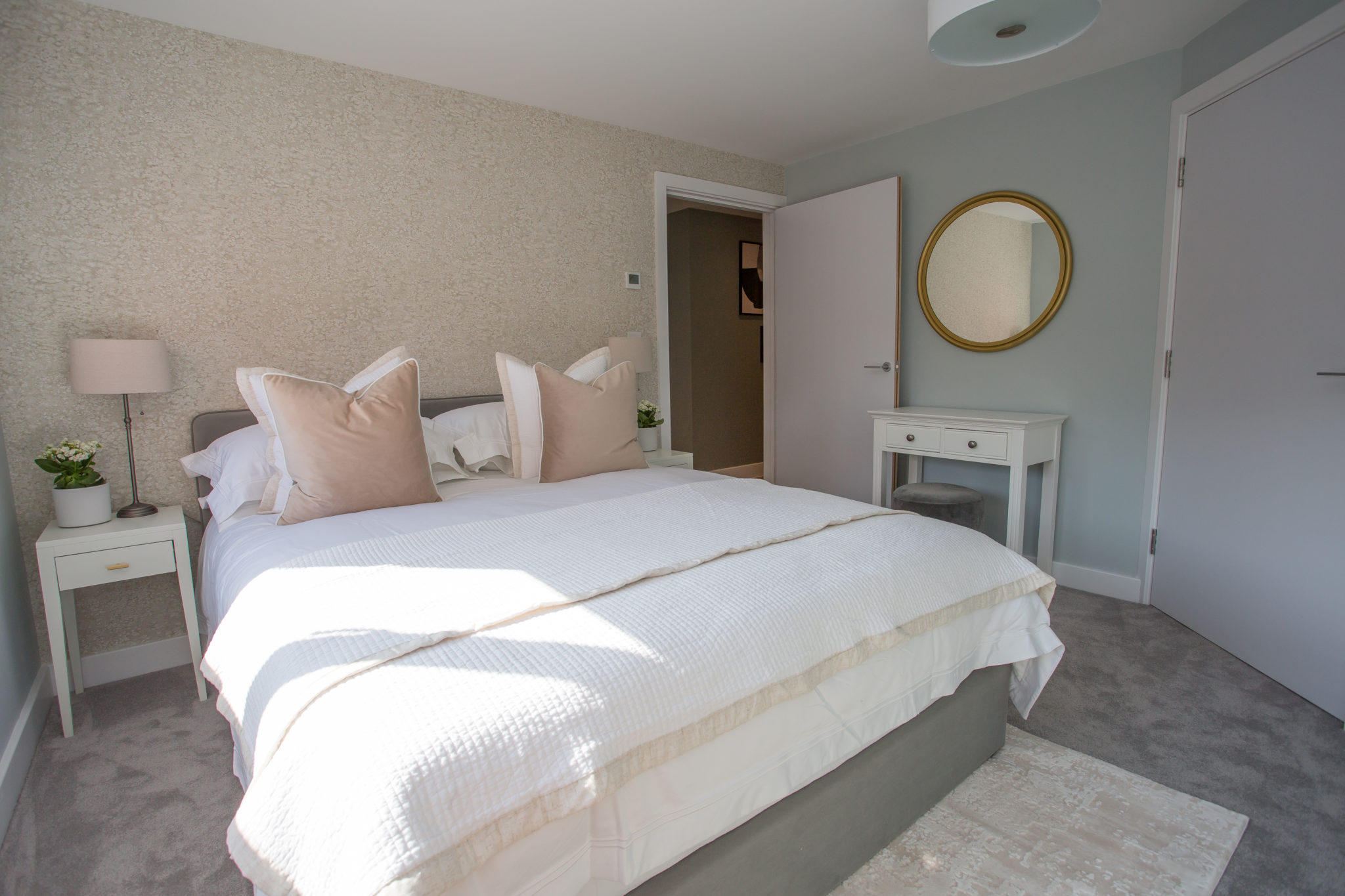
Master Bedroom
The concept here was to create a tranquil and relaxing space. We introduced neutral colours, layers of texture and weathered-stone wallpaper, to form a feeling of sanctuary. The soft pallet of washed blue greys, ivory, pale greys, brass and opalescent tones work well with the existing grey velvet carpet.
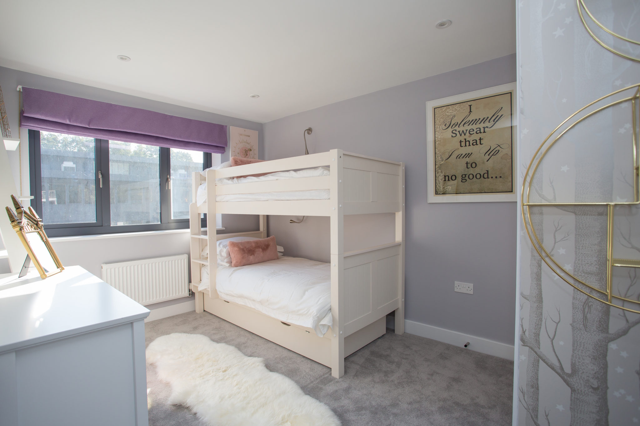
Children’s bedroom
For the children’s bedroom, we introduced a wood and star print wallpaper, sourced from Cole & Son to define the entrance. As the children are fans of Harry Potter, we wanted to evoke a sense of fantasy in a subtle way, through the use of soft lilacs and greys, as well as adding artwork relating to the story.
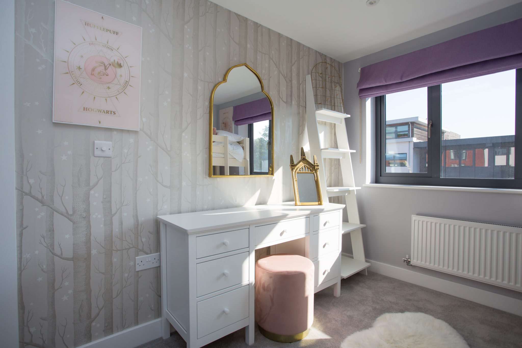
We sourced a gold metallic arched mirror from Melody Maison to further enhance the magic. Furthermore, the soft tones and textures help to create a space that’s inviting and cosy. We added ladder shelving to provide storage, which works well with the fantasy theme.
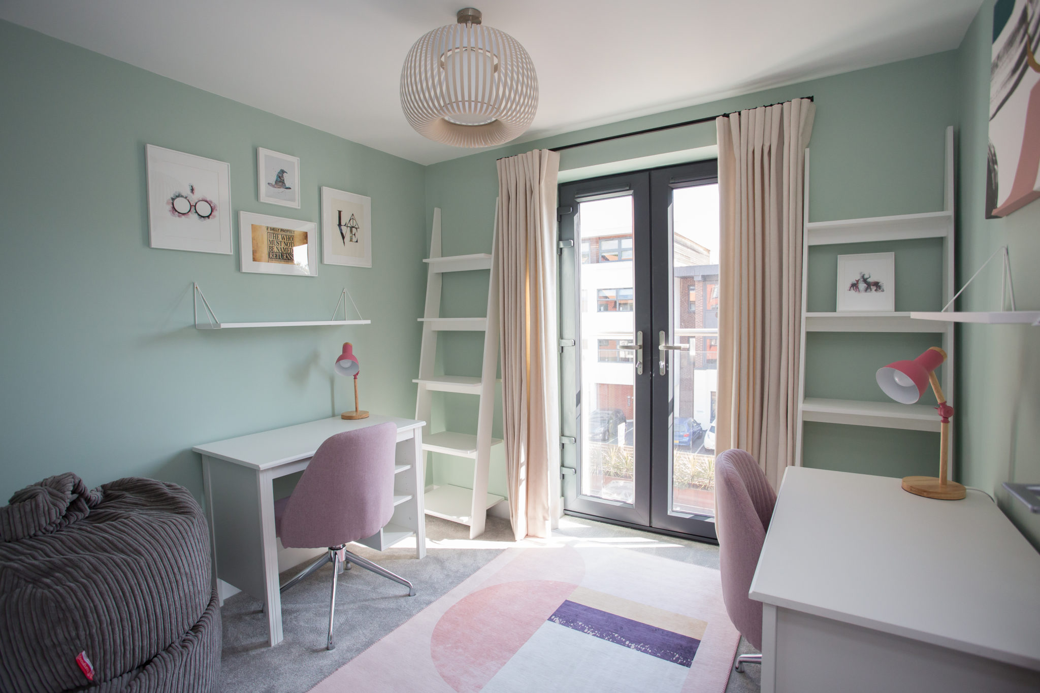
Study Room
For the children’s study room, it was important to our client that we design a space that is thoughtful and creative. We painted the walls in F&B’s Teresa’s Green, which has a calming and therapeutic effect but still feels cheerful when combined with the white furnishings. These tones work well with the existing pale grey carpet and window frame, and the pops of pink and teal help to elevate the space. We also introduced beanbags sourced from Big Bertha Original for comfort, as well as allowing space for a small sofa bed.
Working in harmony with the existing tones, we’ve elevated this property to create a feeling of warmth that is inviting and homely. Through the use of textures and colour, we’ve been able to reflect our client’s wishes for a contemporary and modern home that is also effortlessly elegant.
Project Credits
At Decorbuddi we work as a team with our clients, colleagues and trusted preferred suppliers, each and every one contributing to the successful delivery of the project. This project was designed by Decorbuddi interior designer Tracy Duncan
Photographer: Beth Mercer Photography
For further inspiration and ideas, you can find more of our featured projects here. If you have any questions or would like help with your project, please do not hesitate to get in touch, we would love to hear from you.