
How to Decorate a Small Apartment: Insights from Professional Designers
With first-hand expertise from Decorbuddi designer Lorraine Sakharet.
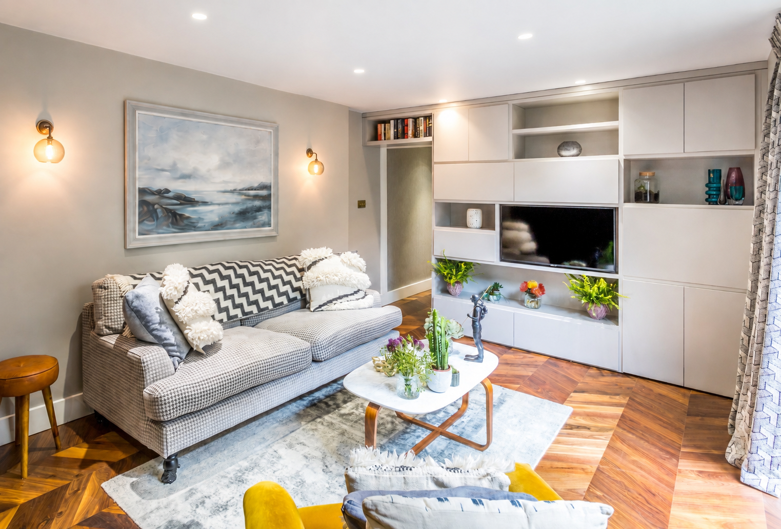
Knowing how to decorate a small apartment starts with understanding why it feels small in the first place, and the answer is rarely the one people expect.
Key takeaways:
Prioritise scale over quantity: one well-proportioned piece reads as more luxurious than several smaller ones competing for visual space.
Invest in bespoke joinery where off-the-shelf options fall short: custom built-ins eliminate dead zones and create a cohesive, architectural finish.
Use sightlines and light deliberately to borrow perceived space from adjacent rooms or the outdoors without structural changes.
Do not scale everything down: too-small furniture makes a room feel bitty and apologetic. Fewer, well-proportioned pieces win.
Design for comfort and cohesion, not size at all costs: the goal is a space that feels intentional, not merely bigger.
The most common mistake is treating a space problem as a clutter problem. People clear surfaces, give away furniture, and still walk back into a room that feels cramped and unsatisfying. The real issue is usually scale and sightlines, not the number of objects in the room.
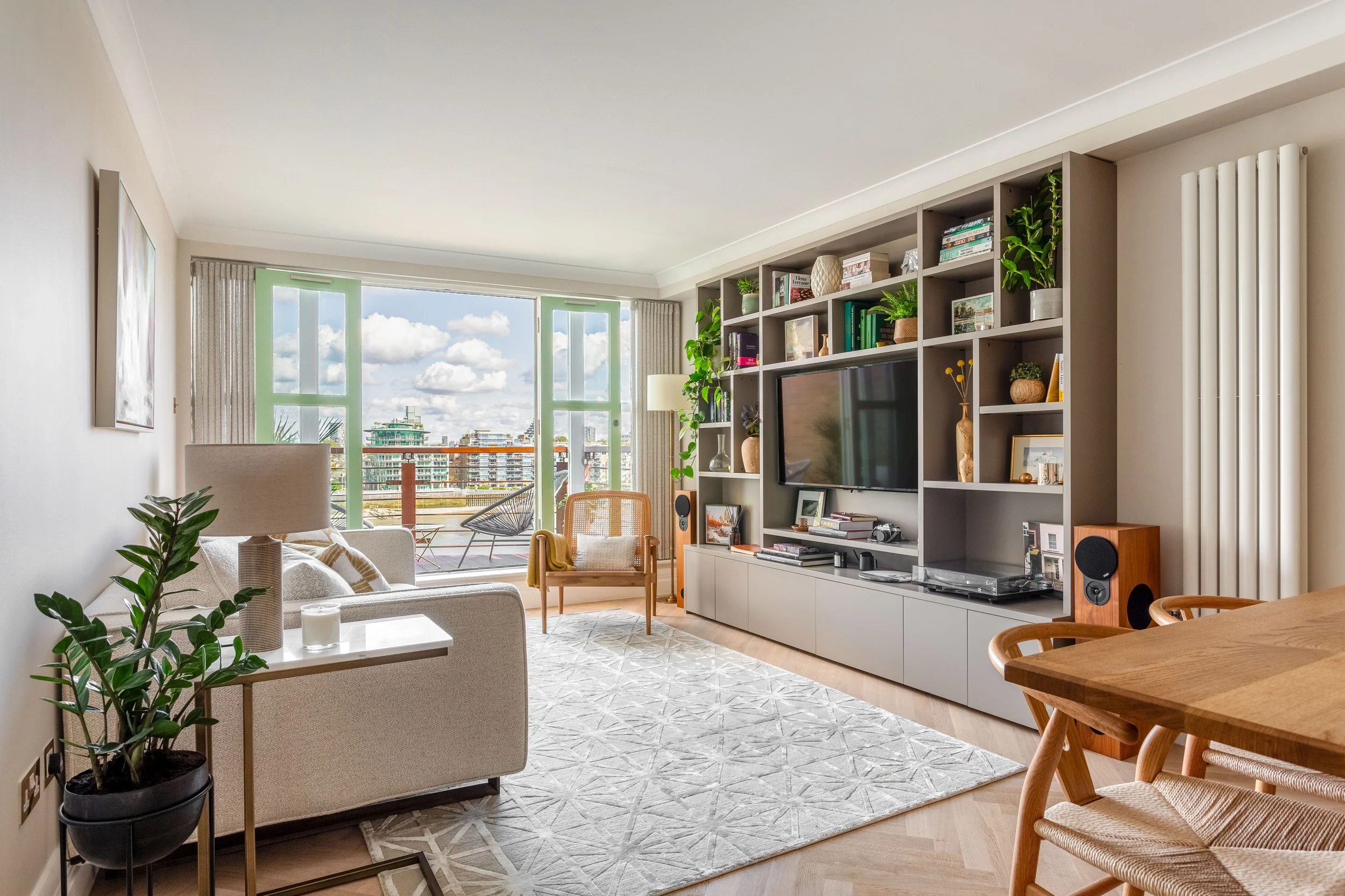
Sightlines are the uninterrupted visual paths your eye travels across a space. When furniture blocks those paths, or sits at the wrong height for the room, the brain reads the space as smaller than it actually is. A sofa pushed hard against every wall, a rug that is too small, a scatter of low side tables: each one quietly chips away at the sense of volume.
Trying to fix this by buying smaller furniture usually makes it worse. Scaling everything down creates what designers call the "dollhouse effect", a room where nothing feels properly anchored and the proportions read as provisional rather than considered.
At Decorbuddi, the starting point is always how you want the space to feel, not what you need to buy. That shift, from acquisition to experience, changes every decision that follows. And it begins with one foundational principle: scale.
Mastering Scale and the Art of the 'Hero' Piece
One of the most counterintuitive principles in small-space design is that bigger furniture almost always makes a small room feel larger, not smaller.
The instinct to downsize everything, swapping a generous sofa for compact chairs or a full-length mirror for a small decorative one, works against you. Several small pieces fragment the eye, multiplying the number of places it has to stop, so the room ends up feeling busy and cramped. One well-chosen 'hero' piece, such as a deep, full-width sofa, anchors the room and gives everything else something to relate to.
"Using furniture that is too small can make a room feel bitty and apologetic," says Decorbuddi designer Lorraine Sakharet. "I would rather introduce fewer, well-proportioned pieces that give the space purpose and make it feel considered."
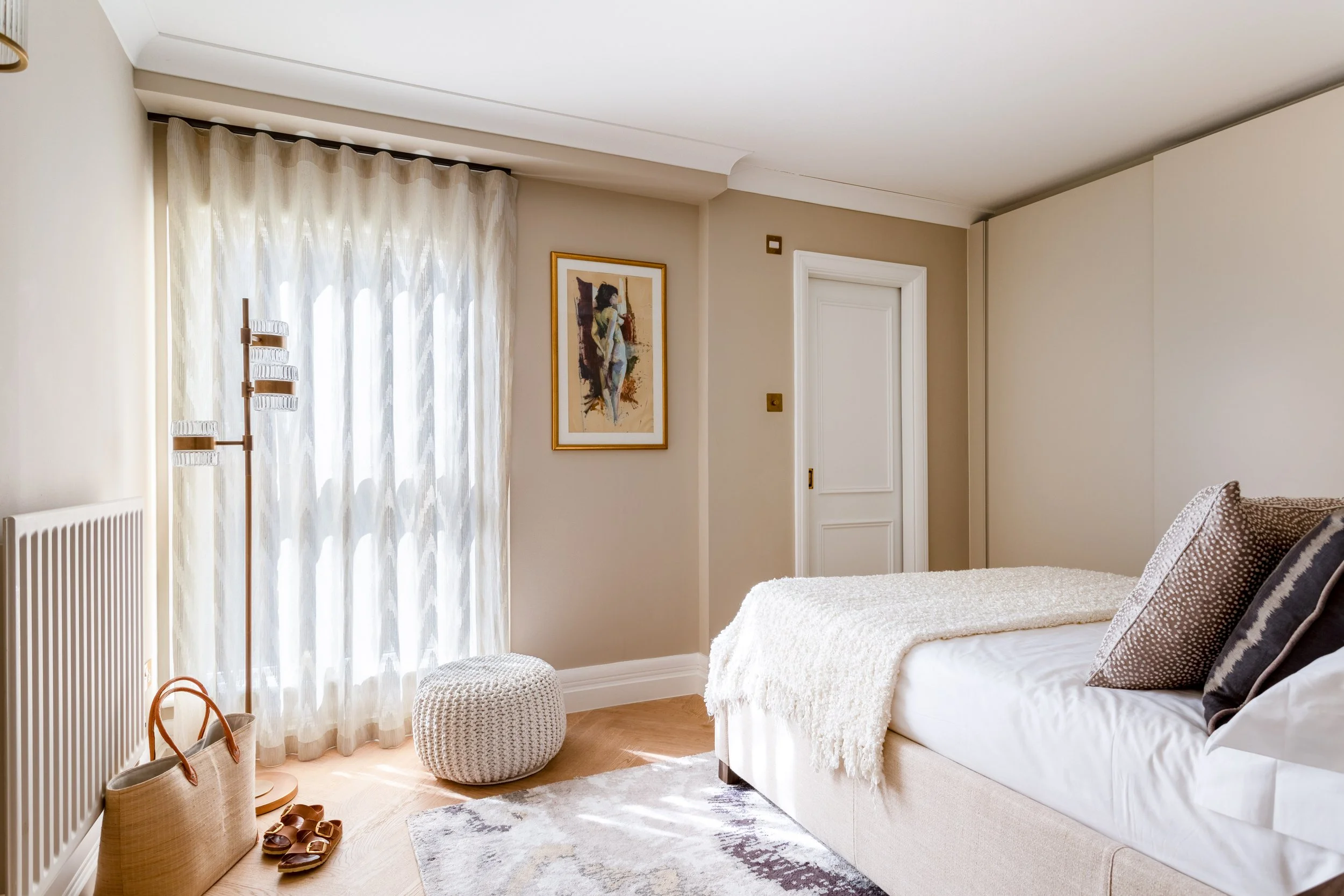
Vertical space matters as much as floor space. Drawing the eye upward, through floor-to-ceiling shelving, tall pendant lights, or curtains hung close to the ceiling, creates a sense of height and opens the room out without touching a single wall. Taking joinery all the way up does the same job: as Lorraine points out, full-height cabinetry can actually make a compact room feel taller.
The choice of furniture legs matters more than most people expect. 'Leggy' furniture, pieces raised on slender legs rather than sitting flush to the floor, keeps the visible floor area open, which signals space even when square footage is tight.
Designer tip: Choose one statement piece and build the room around it. A bold, well-scaled sofa or an oversized artwork tells the eye where to land, and prevents the visual clutter that makes small rooms feel chaotic.
That kind of deliberate thinking about scale leads straight to the next challenge, where everything actually goes, and that is where bespoke joinery becomes the quiet hero of a well-designed small apartment.
Bespoke Joinery: Storage That Disappears
Making the most of a small apartment is not only about choosing the right furniture. It is about removing the space that furniture wastes.
Freestanding wardrobes and off-the-shelf cabinets are the usual culprits in a cramped flat. They rarely sit flush to the wall, they leave awkward gaps beside a chimney breast or under a sloping ceiling, and they fragment the room. That dead space, the inch beside the wardrobe and the void above the kitchen units, adds up fast in a 500-square-foot apartment.
Bespoke joinery works with the architecture rather than against it. A carpenter-built unit can wrap around a recessed alcove, follow the pitch of a loft ceiling, or sit flush either side of a chimney breast to form a seamless wall of storage. The result reads as architecture, not furniture, and that continuity is what makes a room feel dramatically larger.
Design: Lorraine Sakharet
A real project: a Clapham pied-à-terre
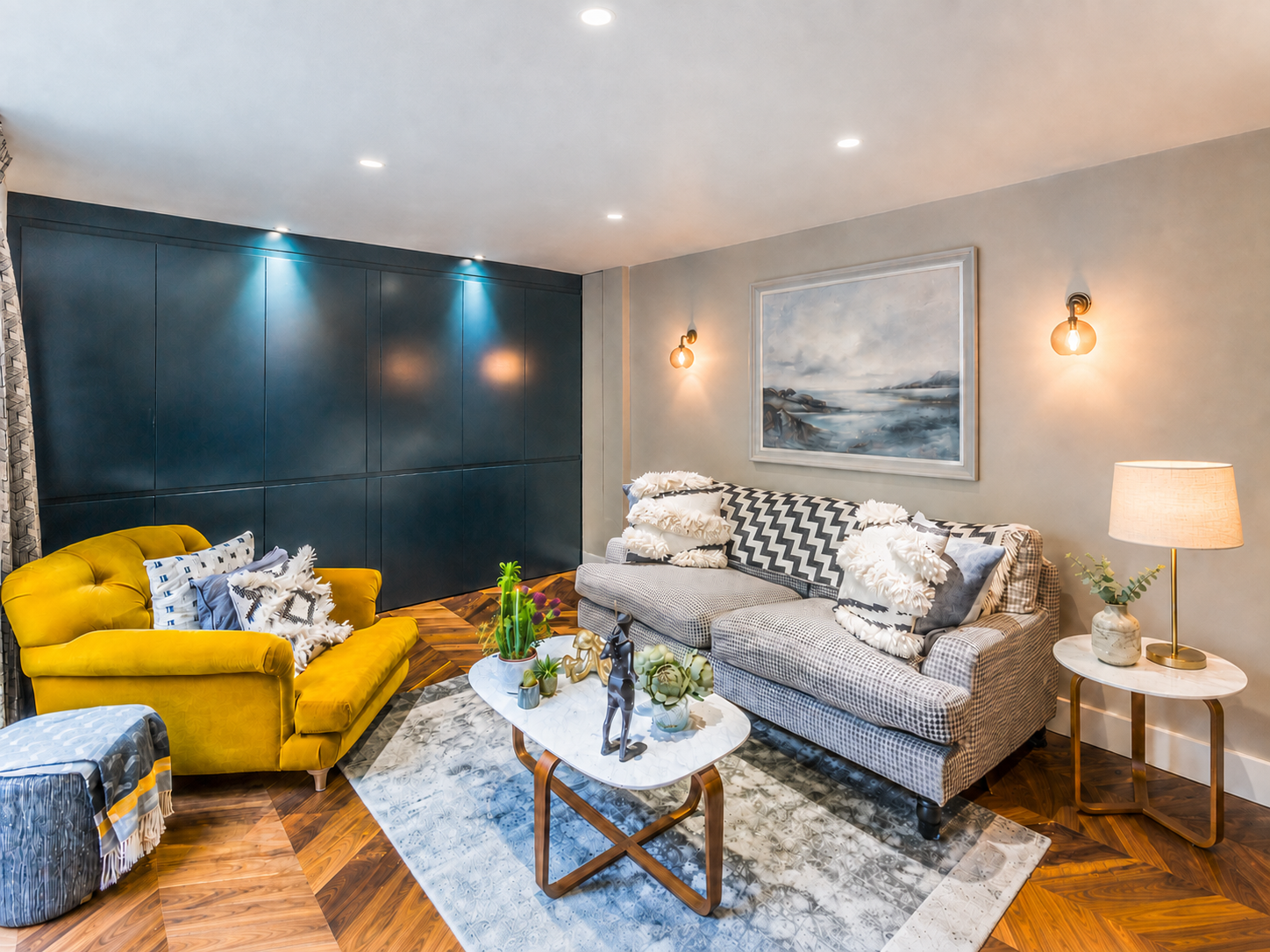
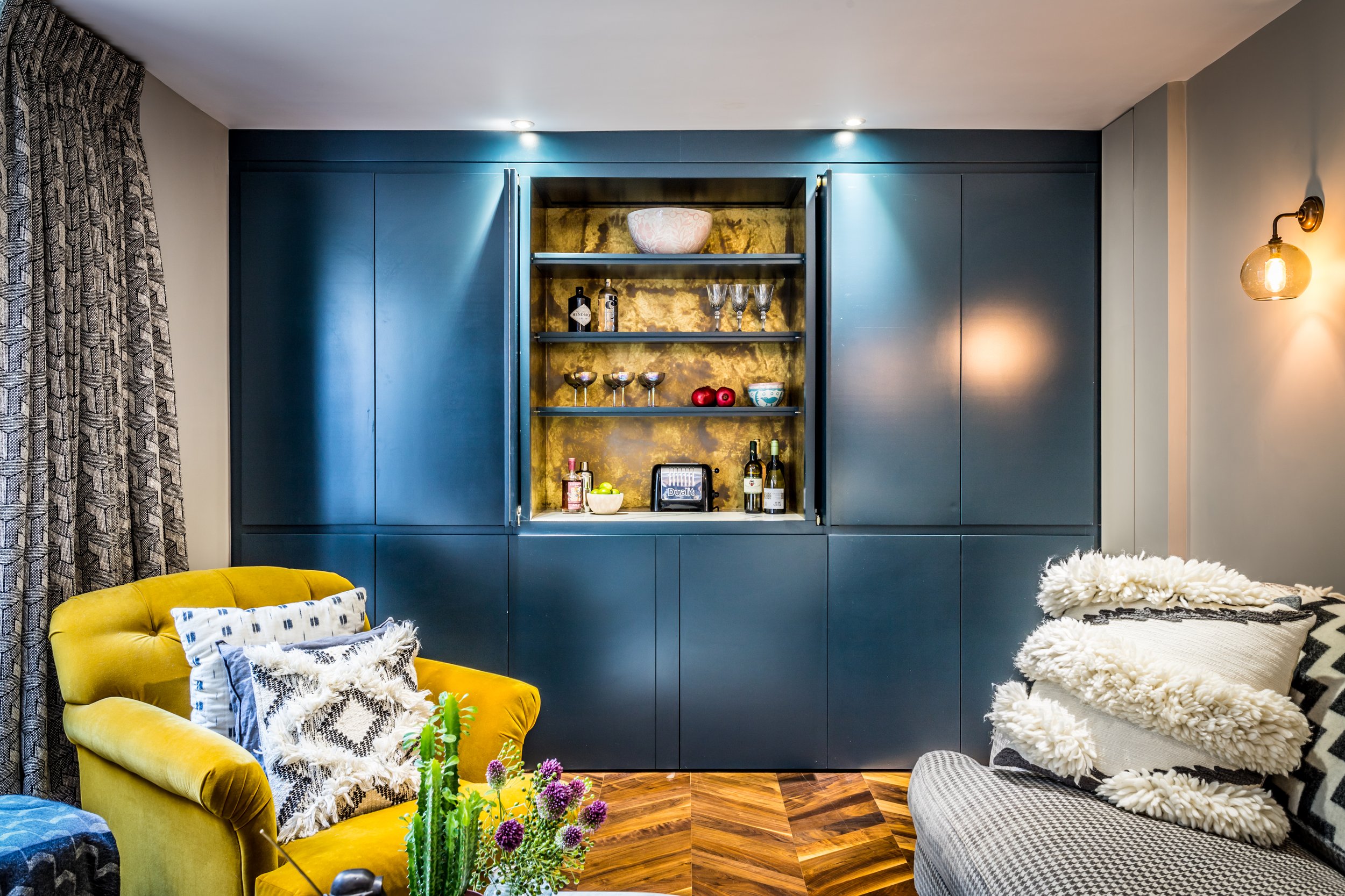
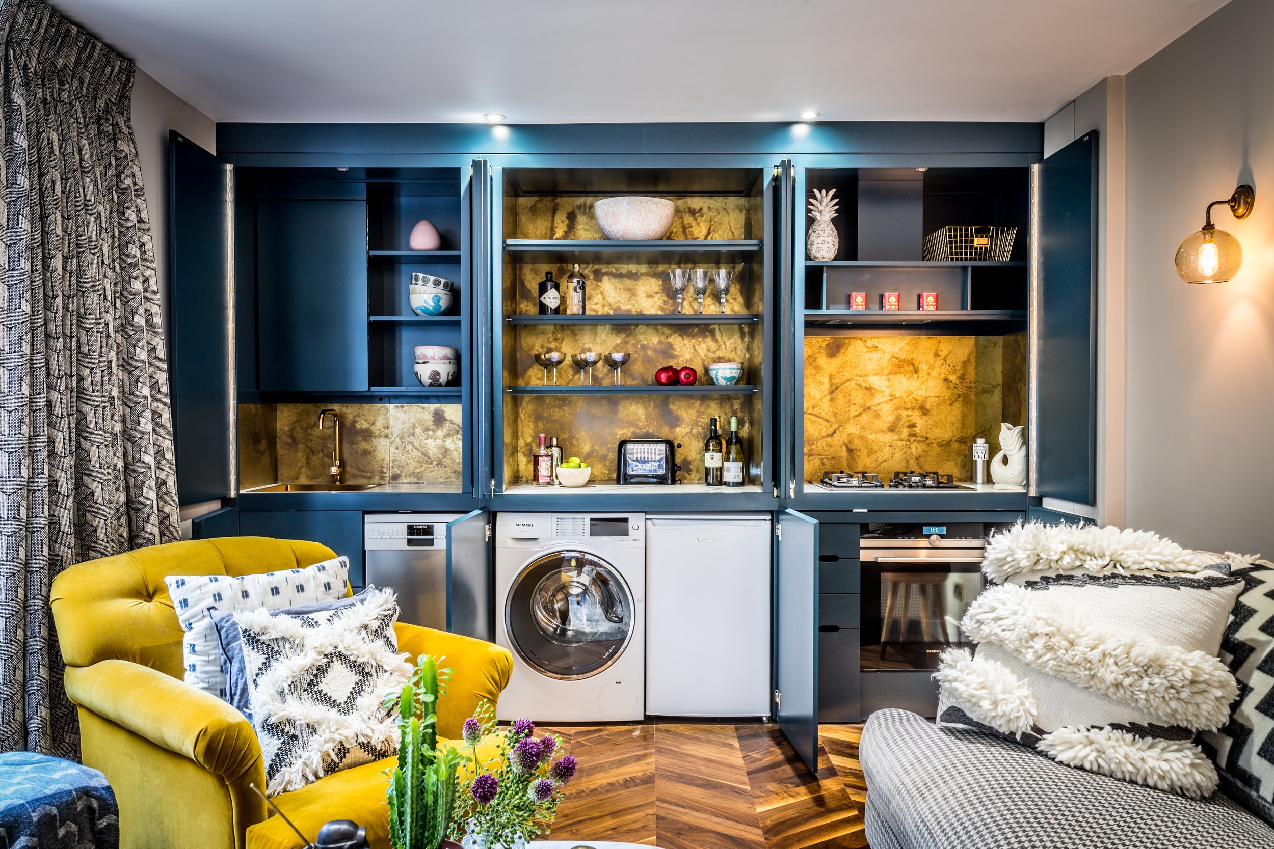
Lorraine used exactly this thinking on a pied-à-terre in Clapham. Her client stayed there during the working week before returning to the family home in the countryside at weekends, so the flat had to feel far more personal and inviting than a typical weekday base, and it had to work equally well for working, relaxing and entertaining. It was a compact one-and-a-half-bedroom flat, with the kitchen and living area sharing a small room at the rear that opened onto a side patio garden. The challenge was to fit everything a fully functioning kitchen needs without letting it dominate the space.
Her solution was to conceal the kitchen almost entirely behind bespoke cabinetry. The sink, hob, fridge and washer-dryer all disappear from view when they are not in use, so the room reads as a sophisticated living space rather than a conventional open-plan kitchen. A central drinks bar stays visible behind pocket doors when wanted, giving the room a natural focal point and an informal place to gather when the client entertains.
Working closely with her carpenter, Richard, Lorraine designed a bespoke dining table that slides neatly over the oven housing when it is not needed and pulls out for meals and dinner parties. The cabinetry on the opposite wall runs floor to ceiling and serves both the working and living areas: the television sits on a pull-out directional arm, a fold-down desk has a stool that tucks discreetly inside when not in use, and a bookcase fills the space above the door frame. Every element does more than one job, which is what lets the apartment feel calm, comfortable and surprisingly generous despite its limited footprint.
Design: Lorraine Sakharet
Clients do not always accept this approach straight away. As Lorraine explains:
"Clients are often wary of how much bespoke joinery I propose for a small room. There is a natural worry that taking cabinetry floor to ceiling, or across an entire wall, will make the space feel enclosed. In practice it tends to do the opposite. By concealing the everyday clutter of life and giving everything a considered place, it creates a greater sense of calm, order and visual generosity."
What usually convinces a hesitant client is seeing the design fully resolved. A single, beautifully detailed wall of joinery stops feeling like more furniture and starts to feel like a way of simplifying the room.
Visualisations help here: they let clients see that carefully proportioned cabinetry creates a sense of architecture rather than simply storage.
The dual-purpose details that made the Clapham flat work are worth borrowing for almost any small space:
Fold-down desks that close flush to a wall panel, reclaiming a home office as living space in seconds.
Window-seat benches with deep drawers beneath, turning a structural ledge into genuine storage.
Built-in seating with hidden depth, banquette dining that stores linen or seasonal items underneath.
A television on a pull-out arm and a bookcase set above the door frame, using the corners of a room that standard furniture ignores.
Once your storage is working hard behind the scenes, the next layer, colour, texture and how you treat your walls, can do equally powerful work on proportion and depth.
Design: Lorraine Sakharet
Colour, Texture, and the Myth of All-White Walls
Painting every surface white is not a strategy, it is a default, and in a lot of small apartments it actively works against you.
The instinct makes sense, because white feels open, airy and clean. But a flat white room with no contrast reads as clinical rather than spacious. Colour used with intention creates depth, and depth is exactly what makes a room feel larger than its square footage.
Dark tones push walls back, especially in low-light spaces such as hallways or north-facing rooms where bright white just turns grey and washed out. A deep slate, a warm charcoal or a rich forest green absorbs ambient light and creates a sense of visual recession, so the wall seems further away rather than closer. It is counterintuitive, but it is a principle experienced designers rely on consistently. It is also territory Lorraine actively looks for: she is not afraid of deeper colours, pattern or full-height cabinetry in a compact room, because a richer palette gives it depth and character.
Texture does the same job. Velvet upholstery, a raw wood shelf (especially one built as bespoke joinery for a tight space), or a panel of stone-effect plaster all add dimension that the eye reads as depth, without adding any physical bulk.

The ceiling, your 'fifth wall', deserves equal attention. Painting it a shade deeper than the walls draws the eye upward and makes the room feel taller. Painting it to match the walls removes the visual boundary between surfaces and creates a cocooning effect that suits bedrooms and reading nooks beautifully.
Window treatments are the last piece. Curtains or blinds in the same colour as the walls remove a hard visual break that would otherwise chop up the room and make it feel smaller. Keep them tone-on-tone, hang them high, and let the architecture breathe.
Getting colour and texture right sets a strong foundation, but even the most considered palette can be undone by the layout and accessory habits worth knowing about.
Common Pitfalls: Mistakes That Shrink Your Space
The most common small-apartment mistakes are not about the wrong colour. They are spatial habits that quietly compress the room around you.
Bespoke joinery and a considered palette open a space up. Even so, none of that will save a room laid out with these four recurring errors:
The 'perimeter push': sliding every sofa and chair hard against the walls feels logical, but it leaves a hollow, corridor-like gap in the middle of the room. Floating the furniture inward, even by a few inches, anchors the seating and makes the space feel intentional rather than empty.
Undersized rugs: a rug that only reaches under the coffee table breaks the floor into disconnected zones. A rug should sit under the front legs of all the seating to hold the arrangement together.
Over-accessorising with small objects: clusters of tiny ornaments read as visual noise rather than character. A few curated 'moments', one considered vignette per surface, say far more about confidence and scale than shelf after shelf of small items.
Ignoring lighting layers: a single overhead fixture flattens a room and removes any sense of depth. Layering ambient, task and accent light gives the eye several points to move between, and the space feels dimensionally richer for it.
And because Decorbuddi's designers bring the buying power to reach materials and fixtures most homeowners cannot source directly, getting the lighting and finishing details right does not have to mean a compromise on quality. Get these fundamentals correct and you set the stage for the decisions that really move the needle on how a small apartment feels to live in.
Design: Jessica Jones
The Bottom Line: Designing for Impact
Small-apartment decorating works best when every decision is deliberate. Fewer, better choices consistently outperform a room filled with compromise.
Scale over quantity is the principle that separates a space that feels considered from one that feels cluttered. One well-proportioned sofa, a generous rug and a statement light fitting will always read as more luxurious than a room crowded with smaller pieces competing for attention. Restraint is not a budget constraint, it is a design strategy.
Bespoke joinery deserves a place in the conversation earlier than most people expect. Off-the-shelf storage rarely accounts for awkward alcoves, sloped ceilings or the specific rhythm of how you actually live. Custom built-ins remove dead space and give a small room a coherence that flat-pack furniture simply cannot replicate.
Sightlines and borrowed light cost nothing to plan but transform how a room feels. Keeping low furniture beneath the window line, positioning a mirror to catch a garden view, or choosing glazed internal doors to carry daylight deeper into a flat all extend the perceived space without moving a single wall.
Above all, the aim is not to make a small room feel larger at any cost. As Lorraine puts it, the goal is to make it feel comfortable, cohesive and intentional. Professional design is an investment rather than an expense, and in a small space, where every decision counts, that expertise is often what stands between a flat that merely functions and one that genuinely fits your life.

From Vision to Reality: Your Small Space Potential
Knowing what works in a small apartment is one thing. Carrying it out with confidence, and without costly missteps, is another.
Pulling together furniture choices, lighting plans, storage solutions and a coherent colour palette takes real coordination. When you are managing that alongside daily life, the details that matter most are often the ones that slip through.
This is where a fresh, professional perspective makes a genuine difference. Decorbuddi's 'Get Started' expert consultation is designed as exactly that: a low-friction first step that gives you professional clarity without committing to a full project brief. Bring your floor plan, your ideas, or simply your frustrations, and leave with a practical direction.
With a team of more than 20 independent designers, Decorbuddi matches the right professional to your space, whether your priority is spatial planning, bespoke joinery like Lorraine's, or garden design for a small outdoor area. That is a depth of knowledge a single generalist opinion cannot match.
Small spaces, done well, do not feel like compromises. They feel considered. Professional design reveals potential that is easy to miss when you are too close to your own four walls. If you are ready to take the next step, explore Decorbuddi's residential design services and find out what your space is really capable of.