Wimbledon Interior Design Project
Wimbledon Interior Design – The renovation of a beautiful family home in Wimbledon.
Working with Qualitas Architects, Design and Build, our clients created this beautiful new extension and reconfiguration of the ground floor of their Wimbledon home.
Initially working off plan, we were invited to design the interior, to include the entire ground floor, incorporating open-plan living and dining, games room, library, office, utility, cloakroom, entrance hall and staircase. We later went on to help with the conversion of the garage into home office and gym and update the bedrooms and bathrooms.
Bringing the Outside In
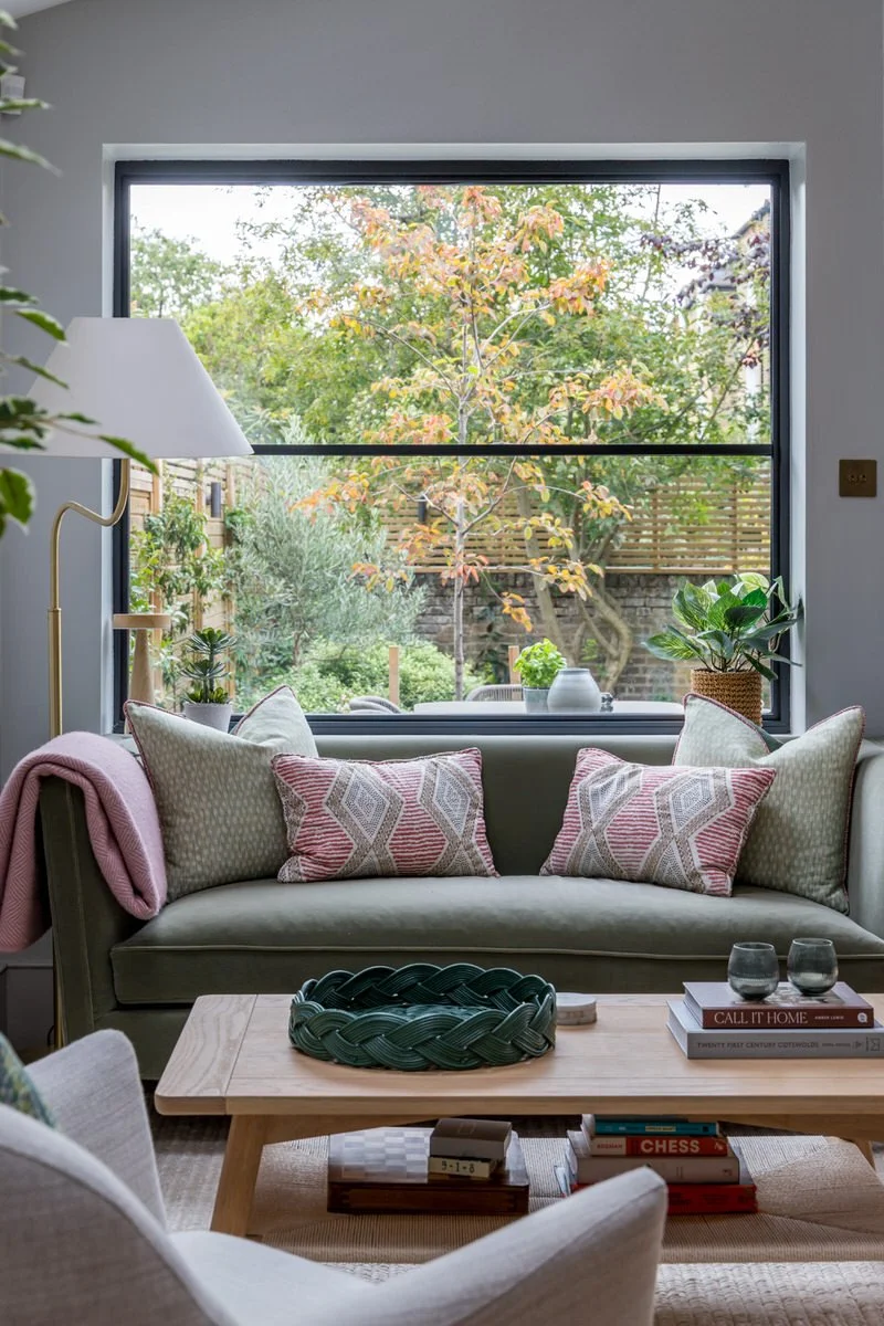
Bringing the outside in, embracing the beautiful garden, was an important aspect of the design concept. As soon as you open the front door, your eye is drawn to the new extension and beyond.
All materials were selected to emphasise the relationship between the interior and exterior spaces. Large scale, parquet flooring flows throughout, providing a quiet decorative foundation.
Hall Lighting
The interior design is a careful balance of form and function, quiet neutrals, vibrant colour and understated elegance with spectacular design details.
The Bella Figura large double drum chandelier is the star of the entrance, supported by the graceful geometric Christopher Farr Puzzle wallpaper, designed in collaboration with textile and surface pattern designer Neisha Crosland.
Reading & Relaxing
To the left of the front door is Jill’s study and a quieter space for reading, relaxing and entertaining. Jill loves deep teal, purple and blues. We used this palette throughout the house.
Here, rich velvets are combined with the soft feathers of the Coldharbour Lane feathered pendant and bee design detailing on the Timorous Beastie cushions. In contrast, the windows were kept clean and simple with new shutters, replacing the old curtains.
Home Office
The desk sits just behind the seating area. All of the cabinetry, media unit, cupboards and floor to wall shelving, was made bespoke. We added Designers Guild wallpaper and lighting behind each shelf.
Games Room
The games and media room is just across the hall. Again, designed to incorporate bespoke storage. In this case, cubes were designed to provide a mix of storage and areas for display.
Jill had the idea of creating a concealed hatch above the bar. Invisible when closed, it opens into the kitchen to enable food and drink to be passed through.
Open Plan Media Room
Comfortable Love Your Home Sofas neatly zone the space to create a media area at the other end of the room. Jane Churchill Silva fabric was selected for the full length curtains. The embroidered leaf design is picked up in the design detailing of the Tigermoth wall lights.
Hallway
Back in the hallway, a Julian Chichester Moreau Cabinet and Porta Romana lamp were placed in the corner en route to the cloakroom. Inspired by a Jan Royere cabinet from the 1940’s, the organic shapes and bespoke teal colourway work well with the view to the living area and garden backdrop.
Cloakroom
As often is the case, the downstairs cloakroom is one of our favourite rooms in the house. The little Moooi perch lights sit perfectly on the Casamance Gustav wallpaper. The coat cupboard doors were carefully papered to blend with the hall.
A contemporary classic, the Moooi Perch light is made from folded paper and brass. Designed to evoke a sense of freedom, the bird swings on its perch if touched.
Open Plan Dining
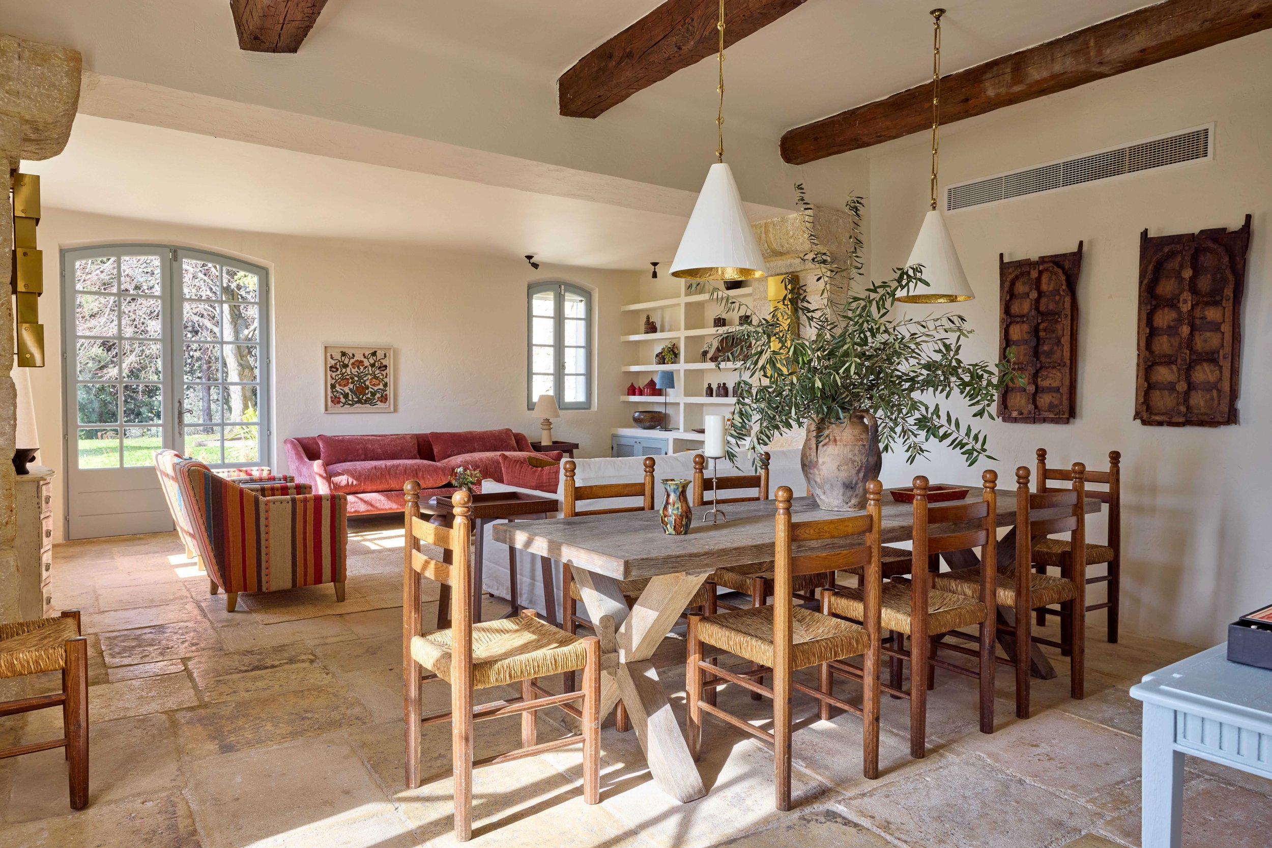
The open plan living area is designed to allow this busy family to be together whilst pursuing their own activities. There is often a jigsaw puzzle in progress at one end of the dining table.
Designed by Christian Werner, the Ligne-Roset Prado sofa was chosen for it’s flexibility. Each cushion is an independent piece that can be moved to suit the direction that you wish to sit in or can even be moved to the floor.
Living Room
The feature wall at the end of the living room is created by the application of a Marmorino polished plaster finish. This unique specialist effect is achieved by using crushed marble powder, coated with a Metallic silver beeswax.
The beautiful effect changes according to the light at different times of day and has the added benefit of being extremely durable.
Study
The second office is positioned just off the living room. Designed in soft-toned pinks, it is a calm study area, with long desk for the children to do their homework.
Contemporary Kitchen
The kitchen was designed and made by Roundhouse. We added bar stools, lighting and a splashback finished with a Tadelakt surface, RAL colour matched.
We worked closely with our client to choose the perfect colour collection of Rothschild & Bickers pendants – Retro above the kitchen island and Liquid for the dining area.
Home Gym
Towards the end of the project we moved on to create the interior design for the garage conversion. The ground floor became a gym and the first floor a home office for James.
Our clients liked the look of the specialist finish that we used in the living room so much that they decided to use it in the annexe also. Its durability makes it particularly suitable on a stair way. Again, the lighting was designed to showcase the effect.
Starting just before Covid 19, much of this Wimbledon Interior Design project was initially conducted on Zoom, moving to site when we were free to do so.
Wimbledon Interior Design Credits:
At Decorbuddi we work as a team with our clients, colleagues and trusted preferred suppliers, each and every one contributing to the successful delivery of the project. This Wimbledon Interior Design project was designed by Interior Designer Helene Dabrowski
Photography: Chris Snook Photography